Alterna
Transforming the Alterna Interior Brand to the Nordic market

Transforming a brand through imagery
Brødrene Dahl sought to strengthen its sub-brand, Alterna, for the Nordic market. Alterna offers a full range of visible bathroom furniture and products in the medium price range, available only through authorised plumbers. The visual identity had originally been developed in central Europe, and the existing communication wasn't a great fit with the Nordic target audience – the brand expression felt cheap, chaotic, and inconsistent, failing to connect with those who value delicate, modern, and inviting design.
We recognised that positioning the brand required starting with the imagery – creating new images that showed how well the Alterna furniture looks and works within a Nordic-styled home. Through skilful art direction and design, we organised large multi-day photoshoots and 3D development and rendering, implementing the brand across product catalogues and digital platforms.

From Chaotic to Cohesive: The Challenge
Central European design sensibilities – often more ornate, stronger in palette, and less minimalist – don't resonate with Nordic consumers who value simplicity, functionality, and a distinct aesthetic that combines modern minimalism with natural warmth. The existing imagery and design materials felt generic and disconnected, with marketing materials lacking cohesion through inconsistent styling, colours, and layouts that failed to convey the quality and thoughtfulness of the products themselves.
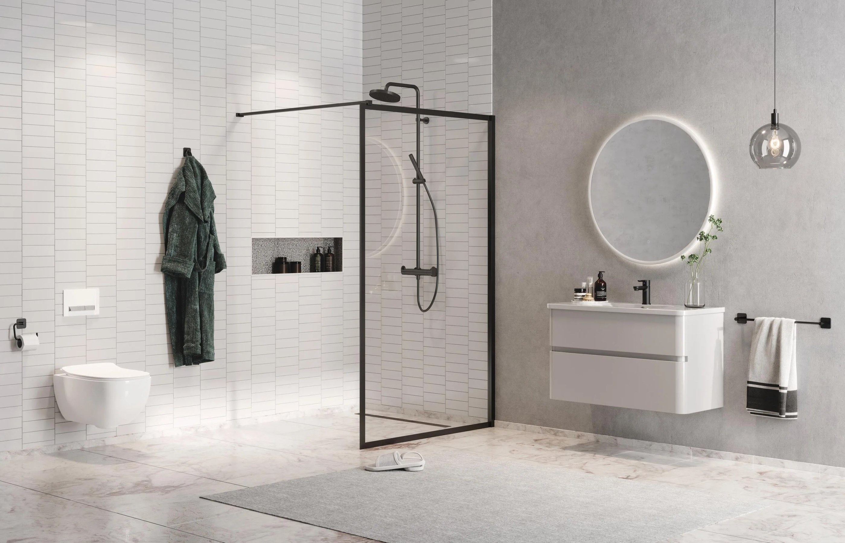
For a brand targeting women aged 30 to 50 – a demographic that values quality, design, and thoughtful choices – the chaotic and inconsistent visual expression was undermining Alterna's positioning. The products themselves were well-designed and functional, but the communication didn't reflect this. We needed to transition from "cheap, chaotic, and inconsistent" to "delicate, modern, and inviting" – creating imagery that showed how well the Alterna furniture looks and works within authentically Nordic-styled homes.

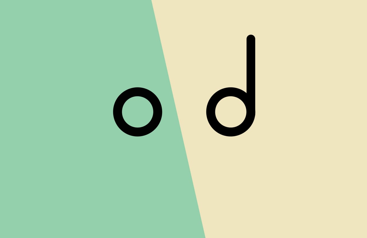
3D or Photo: Can you spot the difference?
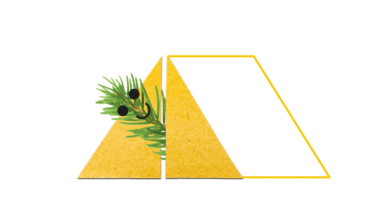
Creating an Authentic Nordic Environment
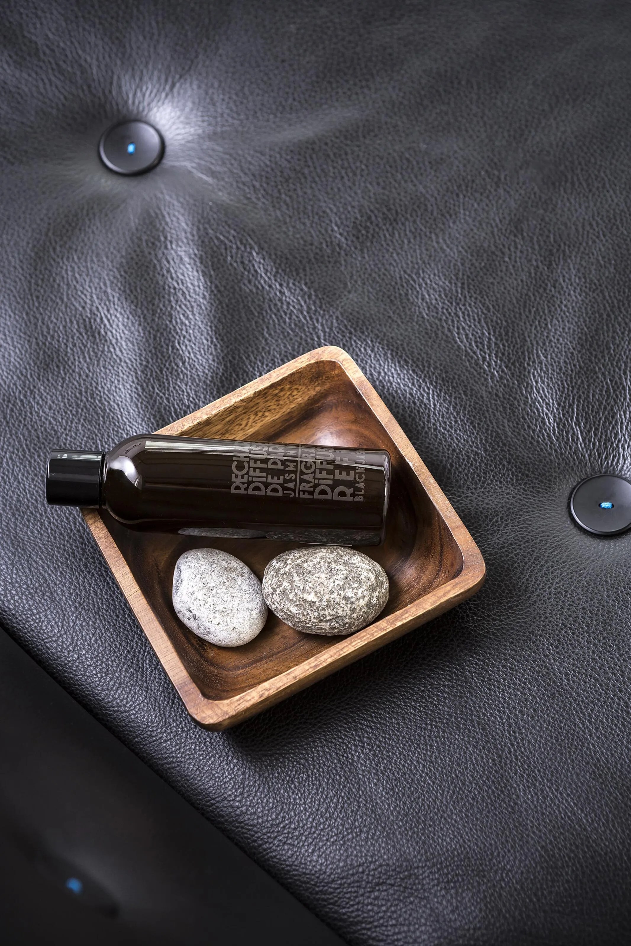
We art directed the interior, styling, and atmosphere – creating a distinct Nordic style with natural elements. Rather than generic bathroom settings, we created environments that felt authentically Nordic, carefully selecting materials, textures, and colour palettes that reflected Nordic design principles: light woods, natural stone, clean lines, and an emphasis on functionality without sacrificing beauty. Natural elements – whether through plants, natural lighting, or organic textures – helped bridge the gap between the manufactured products and the warm, inviting atmosphere Nordic consumers expect in their homes.


Since 2009, we’ve created more than 850 images – both lifestyle and product-focused – for various bathroom suppliers in the Norwegian market. Every project begins with moodboards and 2D/3D room sketches before the scenes are either captured in a photoshoot or developed in 3D.
The Process – Photoshoot or 3D development?
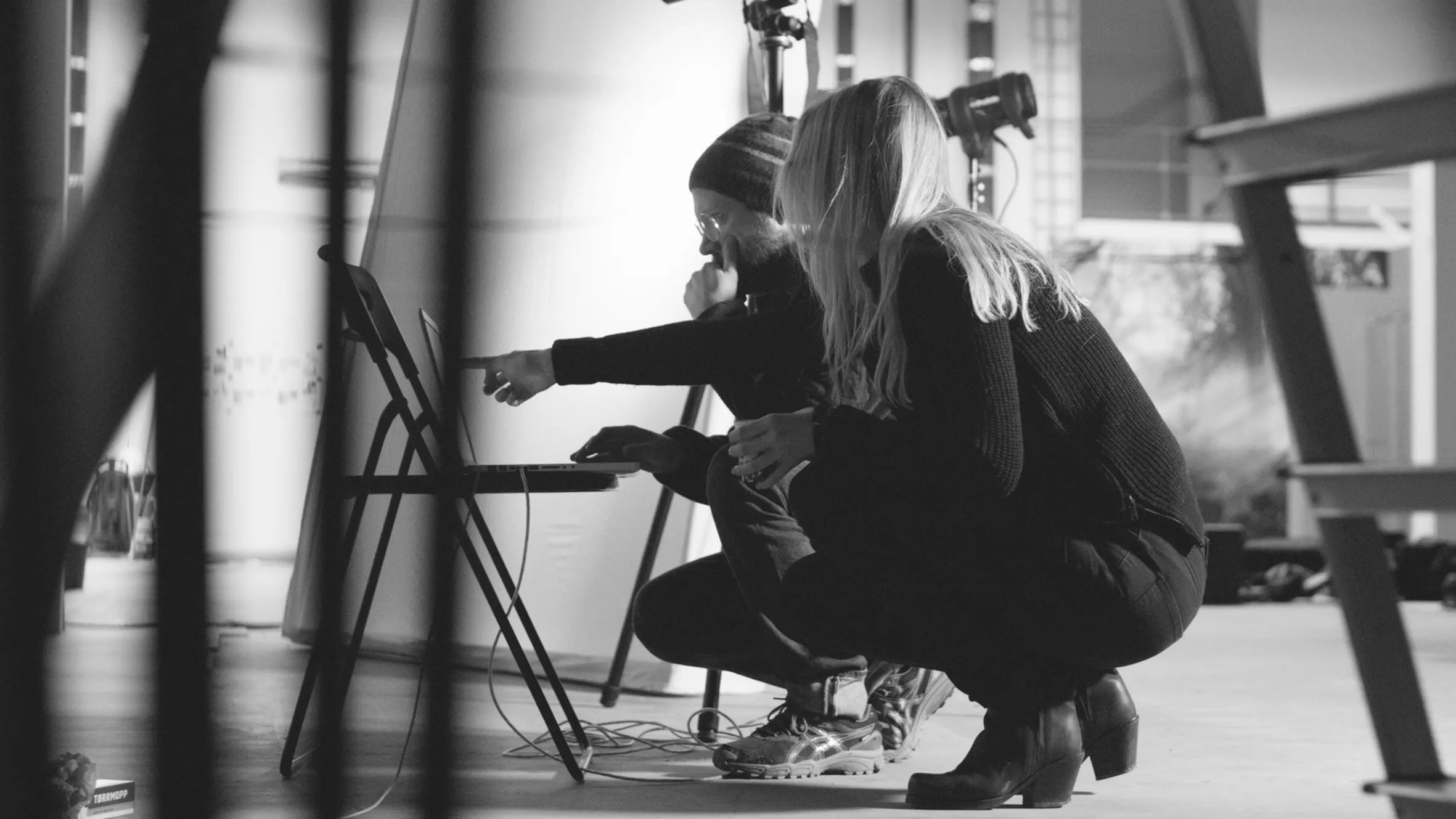
We start each project by mapping needs and planning locations for photoshoots. Concept and style directions are developed based on current trends and colours. 3D visualisation has always helped us plan spaces and product placements before photoshoots begin – we create detailed 3D models that allow us to experiment with layouts, lighting, and product placements, saving time and resources whilst ensuring the final result matches our vision.
For Alterna, we've organised large multi-day photoshoots, sometimes covering eight bathrooms in two weeks. We assemble a team of craftsmen to build the bathrooms and install products, stylists to perfect every detail, and photographers to capture the final result. Our art director directs the visual expression based on the overall strategy and project brief, managing everyone involved and maintaining close dialogue with the client throughout the process.
Over the years, our use of 3D has evolved. In later projects, we began using 3D to modify elements in actual photographs – for example, switching winter landscapes outside windows to summer landscapes, allowing us to update seasonal imagery without new photoshoots. More recently, we've developed entire images in 3D, following the same creative process but without physical photoshoots. What's most cost-effective – physical photoshoots, a hybrid approach combining photography with 3D elements, or fully 3D-rendered imagery – depends on the scope, number of photos needed, and product variations required.

A Long-Term Partnership
Since 2010, we worked closely with Brødrene Dahl on annual Alterna photoshoots and updates of photo material and design, ensuring the brand stayed current and relevant. This long-term relationship allowed us to continuously refine the visual expression, respond to market trends, and maintain consistency across all touchpoints. Over the years, we developed a deep understanding of the brand and its audience, enabling us to strengthen Alterna's position in the Nordic market with each project.


A Cohesive Visual System
The visual identity transformation went beyond imagery. We needed to create a cohesive brand system that would work across all platforms whilst maintaining the delicate, modern expression we were developing.
Simplifying the Logo Treatment
We updated the brand by using only one colour, black, on the characteristic tag or square behind the Alterna logo. This simplification was strategic – it made the brand recognisable, clear, and strong whilst ensuring it would fit seamlessly with most images. The black tag became a consistent anchor point, providing stability and recognition without competing with the product imagery.
Different colours, according to current trends, were used as supporting colours on smaller elements around the identity. This approach allowed the brand to feel fresh and contemporary whilst maintaining core consistency. The supporting colours could evolve with trends without requiring a complete rebrand.


Typography and Layout Refinement
We cleaned up the layout by adding more air and refined the typography by using greater contrasts between sizes and weights. This created better clarity and a more delicate expression – essential for appealing to the target audience of women aged 30 to 60 who value quality and thoughtful design.
The increased white space gave the materials room to breathe, making them feel more premium and less cluttered. The typographic hierarchy became clearer, guiding readers through the information in a logical, comfortable way. These subtle but important changes contributed significantly to the overall transformation from chaotic to calm, from cheap to quality.

From Catalogue to Campaign: Comprehensive Brand Communication
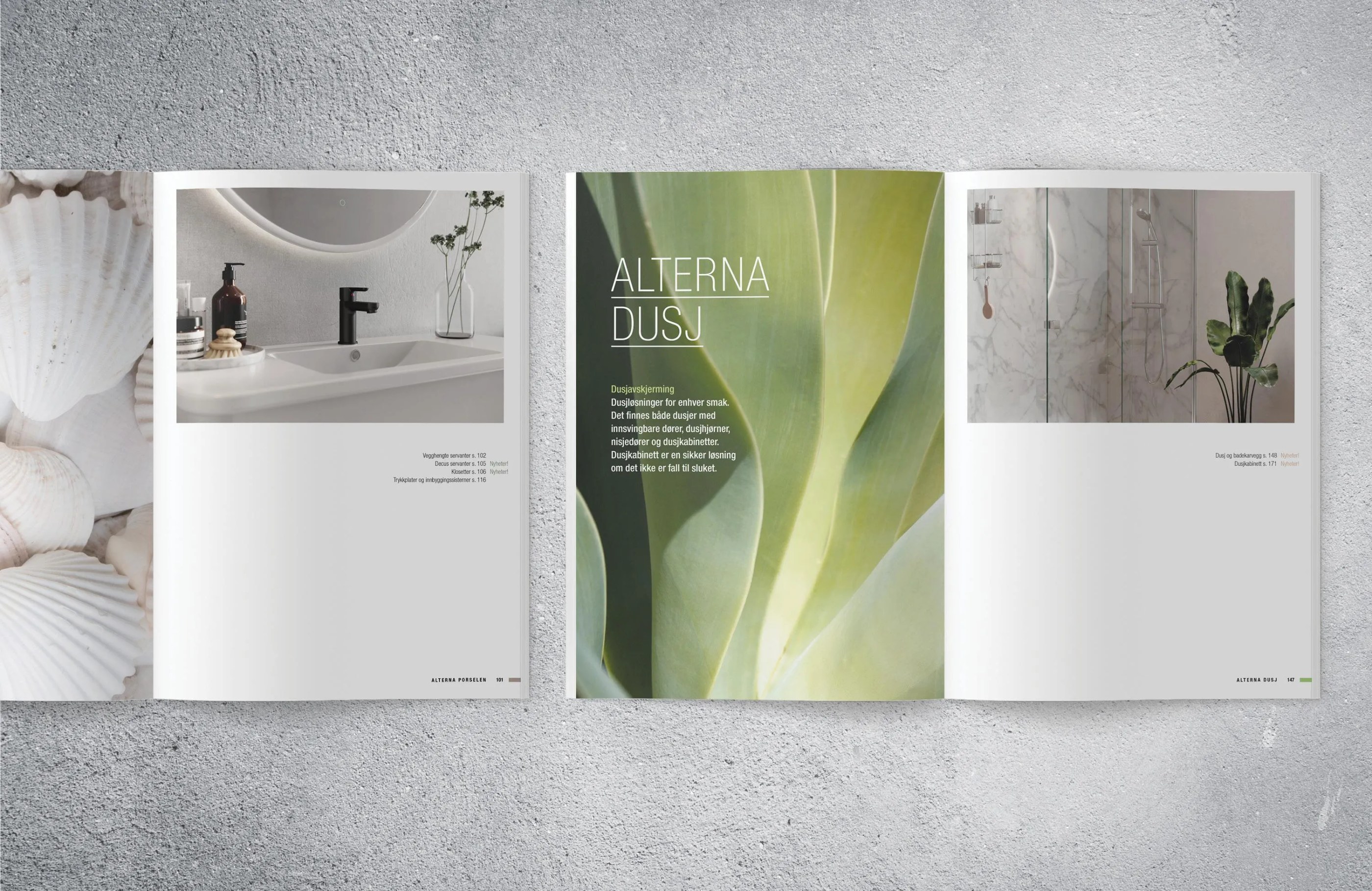
The images we create serve multiple purposes across the brand's communication ecosystem – used online, in large product catalogues, campaigns, advertisements, and various marketing materials. We redesigned their product catalogue, working within restrictions from their existing design manual whilst achieving the desired transformation. To create a cohesive whole with the expression from the photos, nature and texture are used as the main element, connecting the printed material to the lifestyle imagery.
We created a clear system for each series, presenting different sizes, finishes, and possibilities to help customers understand their options clearly. Product illustrations complement the lifestyle photography, providing detailed information about dimensions, features, and specifications. A clean design with an airy layout and modern typography enhances the delicate expression, resulting in a catalogue that feels both aspirational and informative.

Result
With a clearer focus on image material and marketing materials, Alterna has strengthened its position and become a sought-after and established brand. The transformation from "cheap, chaotic, and inconsistent" to "delicate, modern, and inviting" has resonated strongly with the Nordic market, with measurable success: increased brand recognition, stronger market position, and significant growth in sales and popularity.
Alterna has experienced significant growth in popularity and sales after we updated image material and design. Our last catalogue was torn away, and had to be reprinted in a new edition after only a few months.
When customers are literally taking catalogues home, it demonstrates that the brand has successfully connected with its audience. The need for reprinting indicates active engagement with the materials, suggesting that the visual transformation has made Alterna products more desirable and accessible to the target market.


The Year of the Orchestras! Celebration, joy, and community combined in one identity

Clear, Warm, and Professional Healthcare Branding

Perception vs. Reality: Making the Brand Match the Product

Launching the Gold Standard of Sample Preparation

From Alternative Pedagogy to a Science-Based Learning Process

Website for chef Björn Svensson’s newest and final restaurant, FAN
Creating Harmonising Visual Identities for UNOF and NUSO

Transforming Norli: Modernising an Identity with Timeless Roots
