


De Unges Orkesterforbund
Creating Harmonising Visual Identities for UNOF and NUSO
Identities to identify with
UNOF was experiencing growth, but were having issues with their (according to their members) "dull and outdated" identity. We were tasked with the exciting task of revamping their identity and overall communication across both UNOF and NUSO, aiming to instill and reflect a sense of pride and commitment.

UNOF develops tomorrow's musicians
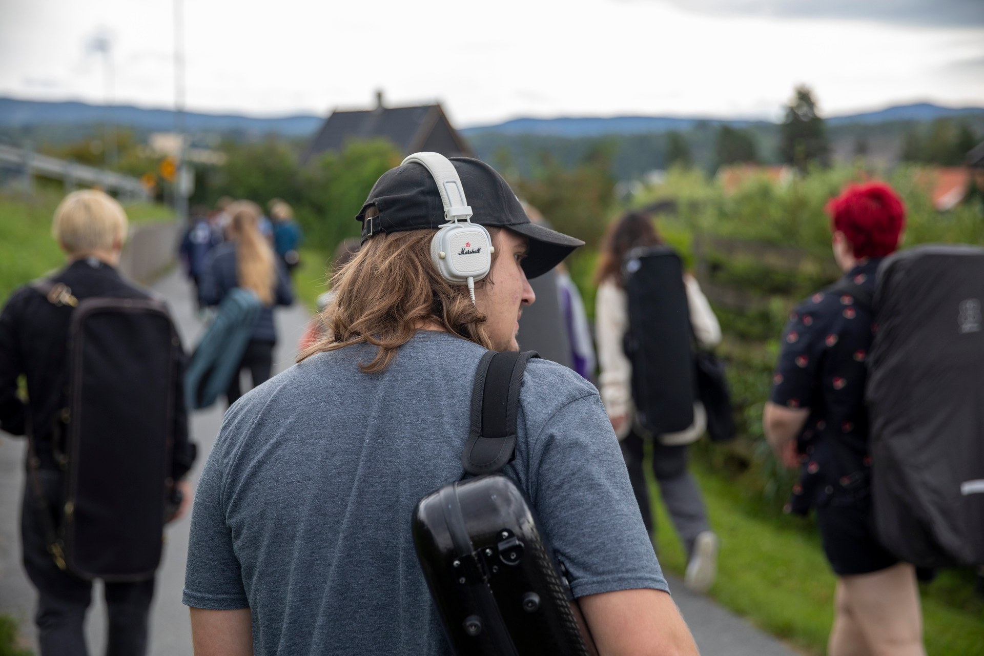
Dedicated to fostering musical development, UNOF ensures that young musicians can receive training and participate in orchestras, regardless of socioeconomic status. Notably, UNOF oversees the Norwegian Youth Symphony Orchestra (NUSO), a national symphony orchestra for individuals aged 13 to 20.
Seeking a more prominent presence in the lives of its members, UNOF wanted to enhance organisational awareness, strengthening its brand, and adopt a more professional image. Internal tools and templates were also developed to make life easier for the organisation and its members.
In the classic segment, it is often a serious and dramatic expression. Since the members are children and youth, we wanted to challenge the genre and the established ideas around classical music. We wanted that the new identity would convey youthfulness, playfulness, development, and inspiration.


From playing sprouts to tomorrow's champions
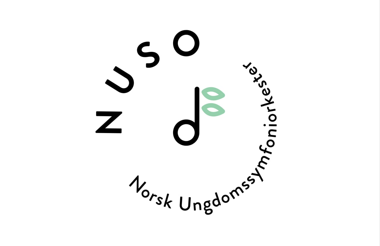
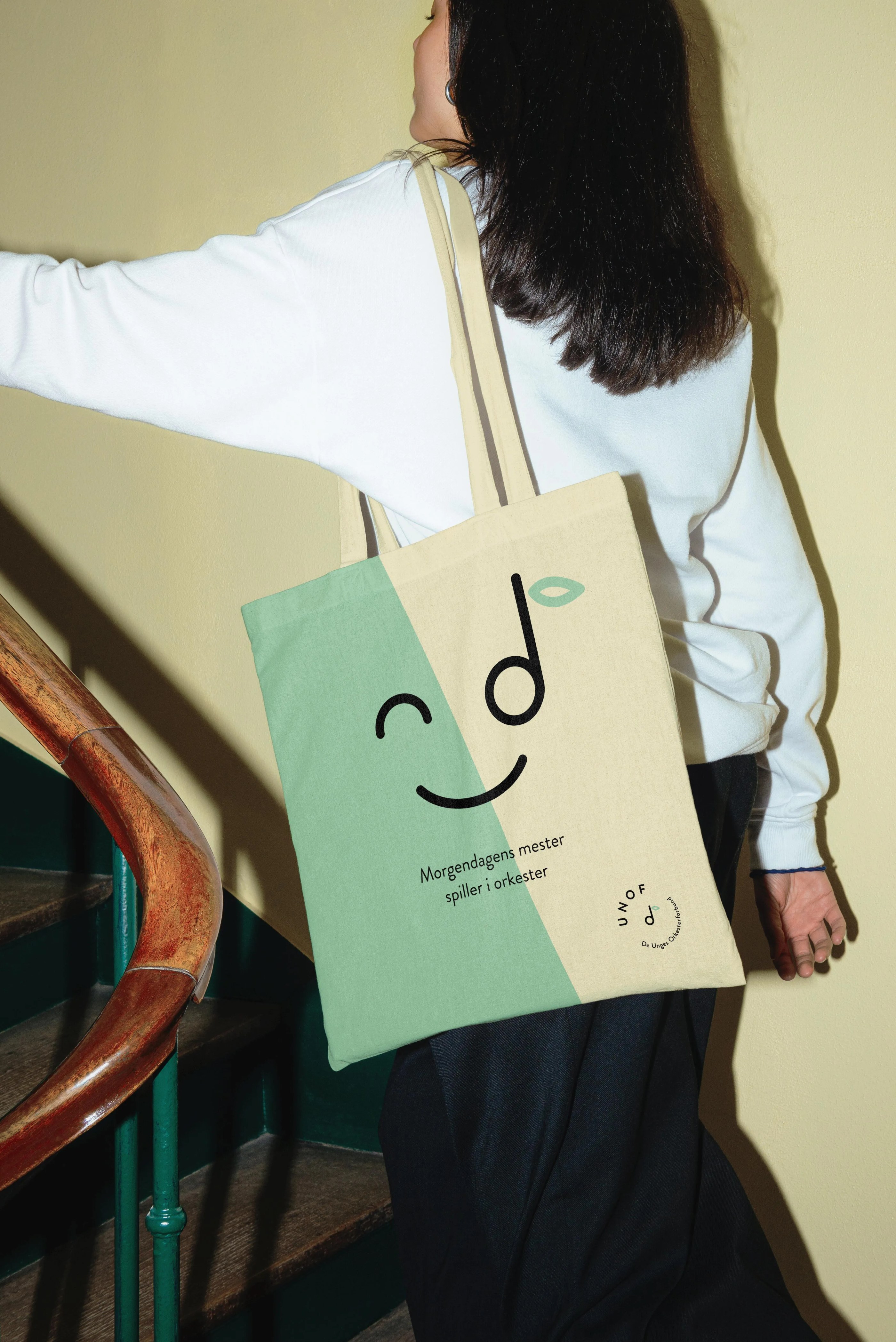
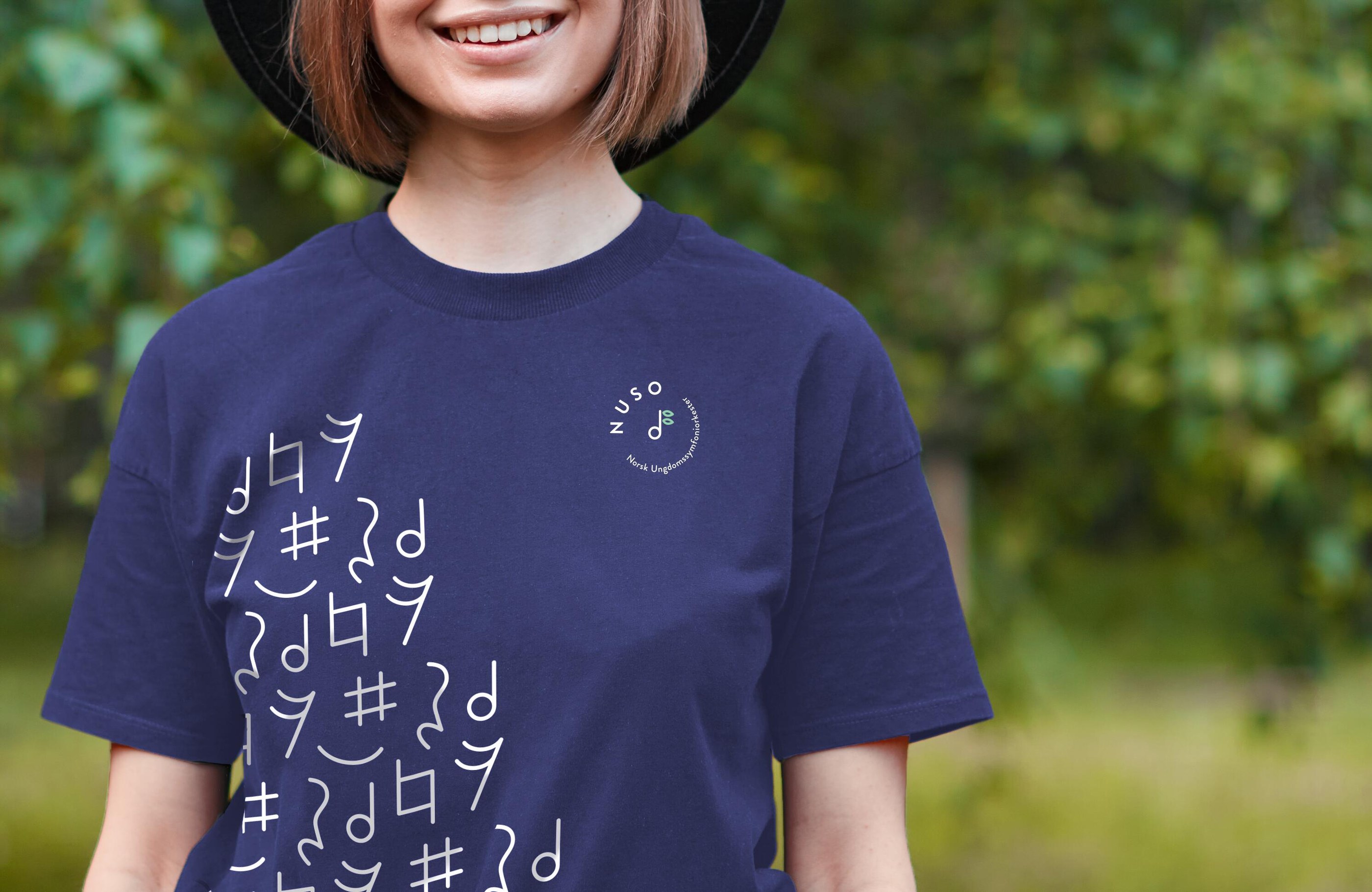
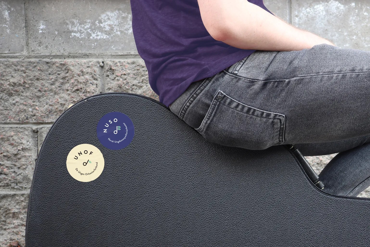
It was important that UNOF and NUSO were given a unified concept and a recognisable visual expression. The logos that were developed are based on an eighth note where the "note hook" is a budding leaf - that grows with age and organisation. The design language is round and warm, both in typography and with humorous illustrations that spring from the logos. Stylised notes have been developed as additional elements and fresh colours have been used to enhance the energetic expression.

A unifying colour
NUSO is a national symphony orchestra for young people between 13 and 20 years old (owned and operated by UNOF). NUSO works actively to provide young orchestra musicians with musical experiences, broad orchestral experience, joys, and personal challenges in collaboration with other like-minded people. Their identity should have a strong affiliation with UNOF, but with a slightly more mature expression and is therefore differentiated with a dark purple main colour.
In addition to the visual identity, various templates were developed for posters, brochures, rollups, and presentations, as well as merchandise for distribution at national collections. Both children and young members were involved in the process of developing the new identity, which was crucial for a unifying and good result.


We have received a palette of different tools to work with, which gives us a more uniform look while there is still flexibility to vary. This process has made us more aware of how we present ourselves visually.
Website Development
The dual website project for UNOF (De Unges Orkesterforbund) and NUSO (Norsk Ungdomssymfoniorkester) addressed the distinct needs of both organisations whilst maintaining brand consistency. Analysis of the existing websites showed user behaviour patterns and identified which content performed well. This helped inform the redesign approach for both platforms.
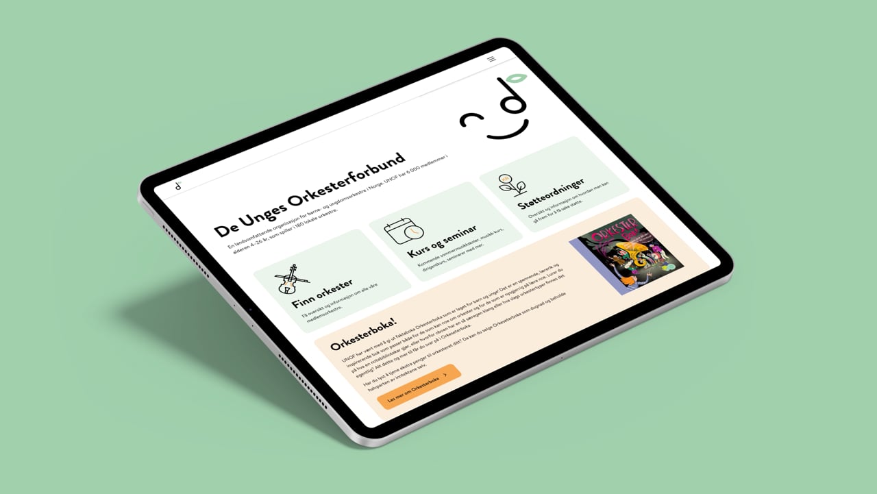
UNOF: "Information First"
UNOF (orkester.no) needed a comprehensive website serving their 6,000 members across 180 orchestras, plus politicians, journalists, and the broader cultural sector.
Requirements included:
- Resource Centre: Guidance for running orchestras, grant applications, and funding information
- Public Information: Content for politicians, media, and stakeholders about the organisation's cultural impact
- News Platform: Coverage of activities, policy developments, and sector updates
- Member Services: Tools like Notalogen (sheet music library) and support programmes
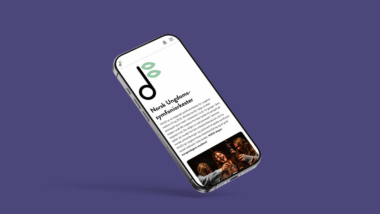
NUSO: "Orchestra Showcase"
NUSO (nuso.no) – the 80-member national youth symphony orchestra needed performance-focused content with comprehensive internal functionality. The internal area covers scheduling, travel coordination, educational resources, and member communications.
Requirements included:
- Concert Information: Upcoming performances and concert archives
- Orchestra Details: Ensemble history, member overview and artistic mission
- Internal Member Area: Secure access for various administrative and member needs
- News Updates: Activities, achievements, and projects

Process Overview
The website process began with site mapping, where content hierarchy was created based on organisational needs and user journeys. This was followed by wireframe development, which built functional layouts and navigation structures for both platforms, before moving on to the high-fidelity design and prototyping.
During this phase, a unified design system ensured consistency whilst accommodating different needs, with orkester.no establishing foundational design patterns that were subsequently refined for nuso.no. This approach kept the process efficient, whilst maintaining visual coherence between the two related organisations.
The final development phase then transformed these designs into functional websites, with comprehensive testing ensuring optimal performance before both platforms went live. Both websites follows best practices and achieves strong Google PageSpeed scores.

Result
The new identity and websites for UNOF and NUSO have transformed the organisations' presence and impact. The fresh visual identity exudes playfulness and warmth, offering versatile design elements that can be easily adapted across platforms and materials. This flexibility captures the youthful, dynamic spirit of the organisations whilst appealing to both existing members and potential newcomers.
Since launch, user engagement and web traffic have increased significantly. Both orkester.no and nuso.no provide streamlined experiences tailored to their audiences' distinct needs, seamlessly balancing informative content with engaging design. Feedback from members, staff, and stakeholders has been overwhelmingly positive, with users particularly appreciating the intuitive navigation, professional appearance, and coherence between the two organisations.
The organisation now benefits from a unified toolkit including templates, promotional materials, and merchandise, enabling consistent and impactful communication across all touchpoints.
WeForm is listening, curious and interested in working out an expression that suits our organisation. And the result was great!
The project successfully cultivated pride and belonging amongst members whilst setting a new professional standard for Norway's youth orchestra movement.


Launching the Gold Standard of Sample Preparation

Where tradition meets modernity in construction branding

Website for chef Björn Svensson’s newest and final restaurant, FAN

Clear, Warm, and Professional Healthcare Branding

Transforming Norli: Modernising an Identity with Timeless Roots

Transforming the Alterna Interior Brand to the Nordic market

Perception vs. Reality: Making the Brand Match the Product

Creating Håvard the Mascot to Improve User Experience in Oslo City Forests
