

Extraction Technologies Norway
Launching the Gold Standard of Sample Preparation

Building a cohesive Brand Identity
Extraction Technologies Norway AS (ETN) is redefining sample preparation in analytical chemistry with its groundbreaking Electromembrane Extraction (EME) technology. Since its founding in 2013 – backed by Innovation Norway – ETN has progressed from a research-focused startup to the market leader in rapid, selective, and eco-friendly extraction instruments.
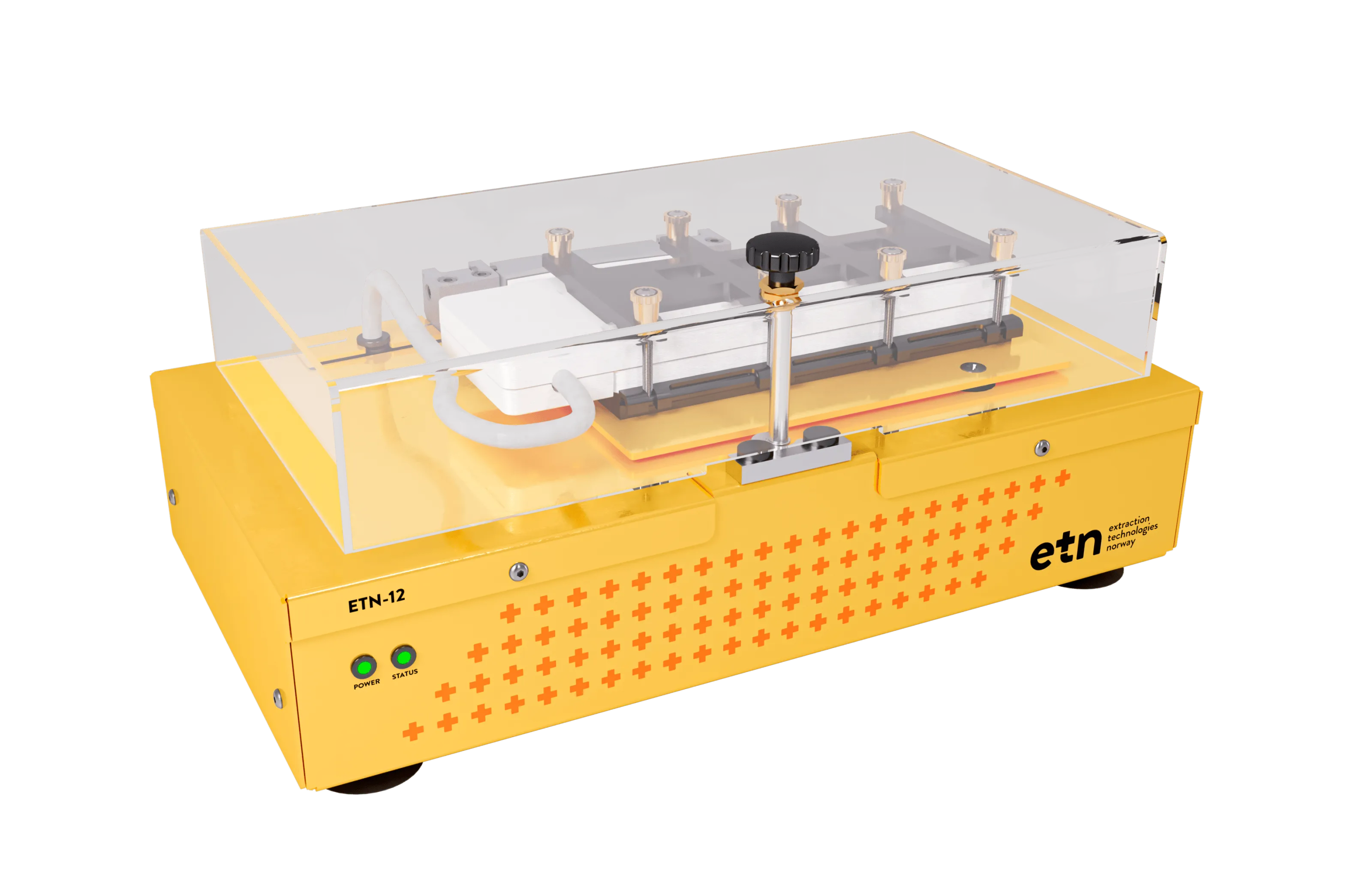
As ETN prepared to launch its first commercial EME instrument, ETN-12, they recognised the need for a cohesive brand identity and contacted us. A unified visual style, modern website, and polished product-and-marketing assets would position ETN to capture early adopters and establish credibility in highly regulated laboratory markets.
Value Proposition
We enable laboratories to test samples more efficiently and precisely by delivering innovative sample preparation technology.
Brand Values
Disruptive: ETN introduces a new approach to sample preparation with Electromembrane Extraction. By continually refining its methods, we keep pushing analytical chemistry forward in practical, meaningful ways.
Caring: ETN focuses on creating solutions that are straightforward to use and kinder to the environment. Lower solvent use and intuitive workflows reflect the brand’s commitment to both lab efficiency and sustainability.
Solid: Built on proven research and collaborations with leading institutions, ETN offers dependable tools you can count on. Each product is designed for consistent, reliable performance in everyday lab work.

Part of the research presentation deck of the market segment. Do you notice the trends?
Research & Discovery
We opened the project with in-depth interviews, competitor audits and visual landscape mapping. We've outlined the discoveries below.
Market insight: Established brands relied on conservative blue-green palettes, abstract science icons and tight sans-serif type, projecting clinical safety but little innovation.
User insight: Lab managers and researchers wanted faster, cleaner preparation methods yet found vendor branding virtually interchangeable.
Internal insight: ETN wished to emphasise its disruptive technology without losing scientific credibility.

Concept Development
We generally share two to four concept ideas in monochrome first, allowing us to evaluate the thinking rather than the colour. For ETN we explored four ideas, each linked to core aspects of Electromembrane Extraction. We give our pros and cons, but in the end it's up to the client to choose.
Concept 1: A discreet plus symbol is woven into the ETN word-mark, connecting the brand to its life-science heritage while echoing the positively charged ions that power Electromembrane Extraction. The result balances medical credibility with clean, geometric precision.
Concept 2: the familiar health cross is rotated to form an “X”, simultaneously referencing eXtraction and a positive charge. The tilted shape adds a sense of energy and movement, capturing ETN’s innovative spirit in a mark that feels both bold and sophisticated.
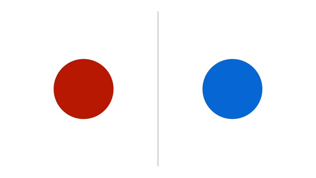
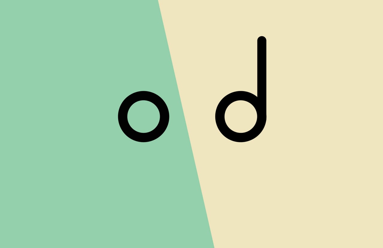
Concept 3: A single circle is bisected on the diagonal, turning the outline of a vial into a clear graphic that signals separation. The two halves reference sample and acceptor phases, while the crisp split expresses the precision and efficiency of Electromembrane Extraction.
Concept 4: A solid circle is “extracted” from a larger source, leaving a negative space that hints at material being pulled out. The plus symbol doubles as a positive-charge marker, reinforcing ETN’s ion-driven process while hinting at healthcare.

The client went with Concept 1 with a discreet plus sign is nestled inside the ETN word-mark
Turning the Concept into a Brand
The client selected Concept 1, where a discreet plus sign is nestled inside the ETN word-mark, and we could start on the refinement process.
We tweaked and refined the logo so the plus aligned perfectly with the counter-spaces of the letters, ensuring the mark reads first as a unified word then, on second glance, as a symbol of positive charge and medical credibility. The plus also became a micro-motif: it appears as a favicon, patterns, etc. We also created a specific version for small sizes with a larger gap.
The result is a logo that operates as both identifier and narrative device, linking every touchpoint—from instrument fascia to social media avatar—back to ETN’s promise of positive, life-improving extraction technology.
We expanded the concept to all other brand elements, like postal elements.

Animation showing the colours merging together creating the gradient.
Colour
Selecting the perfect colour palette is a strategic way to help bring a brand's personality to life. For ETN, we wanted a palette that's bold and trustworthy, with a touch of innovative flair.
Red evokes energy, passion, and power while representing urgency and action. It increases heart rate and conveys confidence and leadership in branding. Blue embodies trust, reliability, and professionalism. As the most universally favoured colour, blue creates stability and corporate credibility, building customer loyalty through trust.
By merging red and blue into a purple gradient, we capture both colours' strengths and adds purple's associations with exclusivity, innovation, and sophistication. This gradient accesses the energy of red and trust of blue while infusing wisdom, creativity, and forward-thinking transformation. Purple remains unconventional in corporate branding, helping ETN stand out in their segment. This unified colour system communicates reliability, disruptive innovation, and premium positioning for their breakthrough technology – all within a single, sophisticated palette.

Typography
Brandon Text and Grotesque was our typeface of choice because together they strike the perfect balance between warmth and precision.

Brandon Text’s open letterforms lend a human, approachable feel to headlines and body copy, while Brandon Grotesque’s clean, geometric shapes ensure clarity and readability across digital and print touchpoints. This pairing reinforces ETN’s brand personality while maintaining the professional crispness essential for scientific communication.

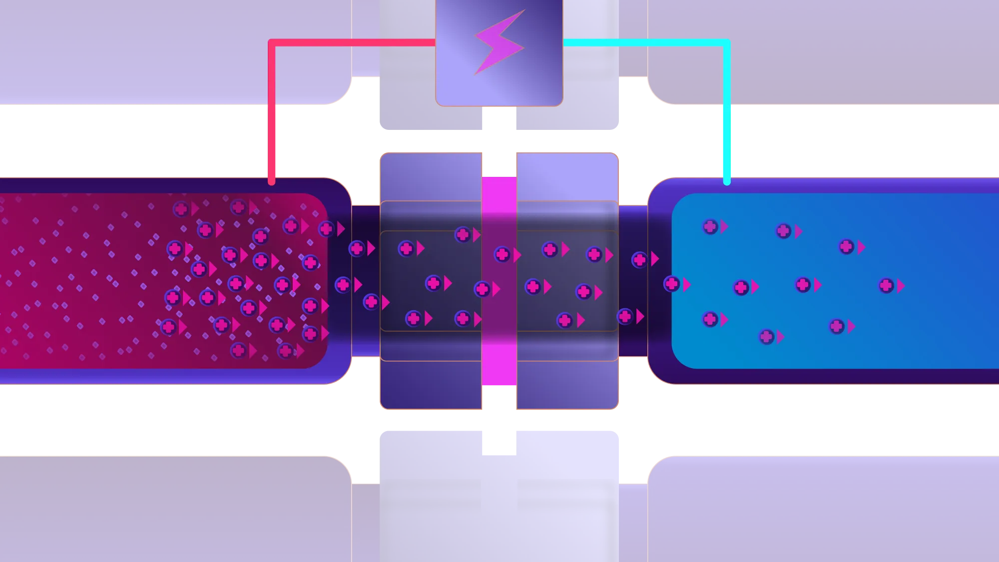

EME process illustrations by Håvard Skeide Glad.
Illustrations
In the pre-launch phase, we introduced wireframe visuals based on prototype designs to suggest the form and function of ETN-12 without implying a finalised design. The semi-transparent, blueprint-style renderings hint at key features – the EME modules, control interface, and sample chambers – while maintaining an open, developmental feel.
This approach builds anticipation and communicates progress without overcommitting to a final look, reinforcing ETN’s innovative spirit and scientific credibility.
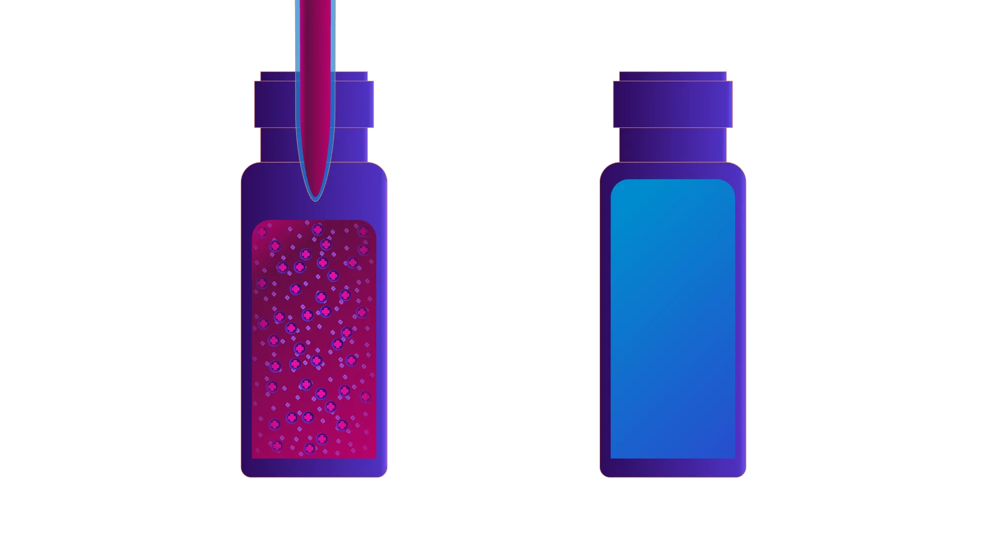
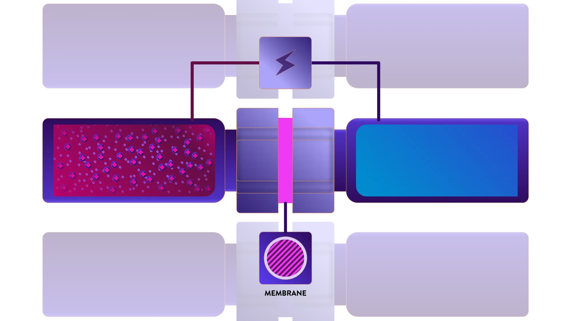
We also created illustrations that show how EME works. By applying an electric field across the membrane, charged analytes migrate from the sample solution into the acceptor solution, while non-ionic compounds and oppositely charged ions remain behind. The visuals employ a bold red-to-blue gradient to distinguish sample and acceptor phases, simplified geometric shapes for clarity, and particle motifs to trace analyte movement – making complex electrokinetic processes instantly understandable.


Packaging Design
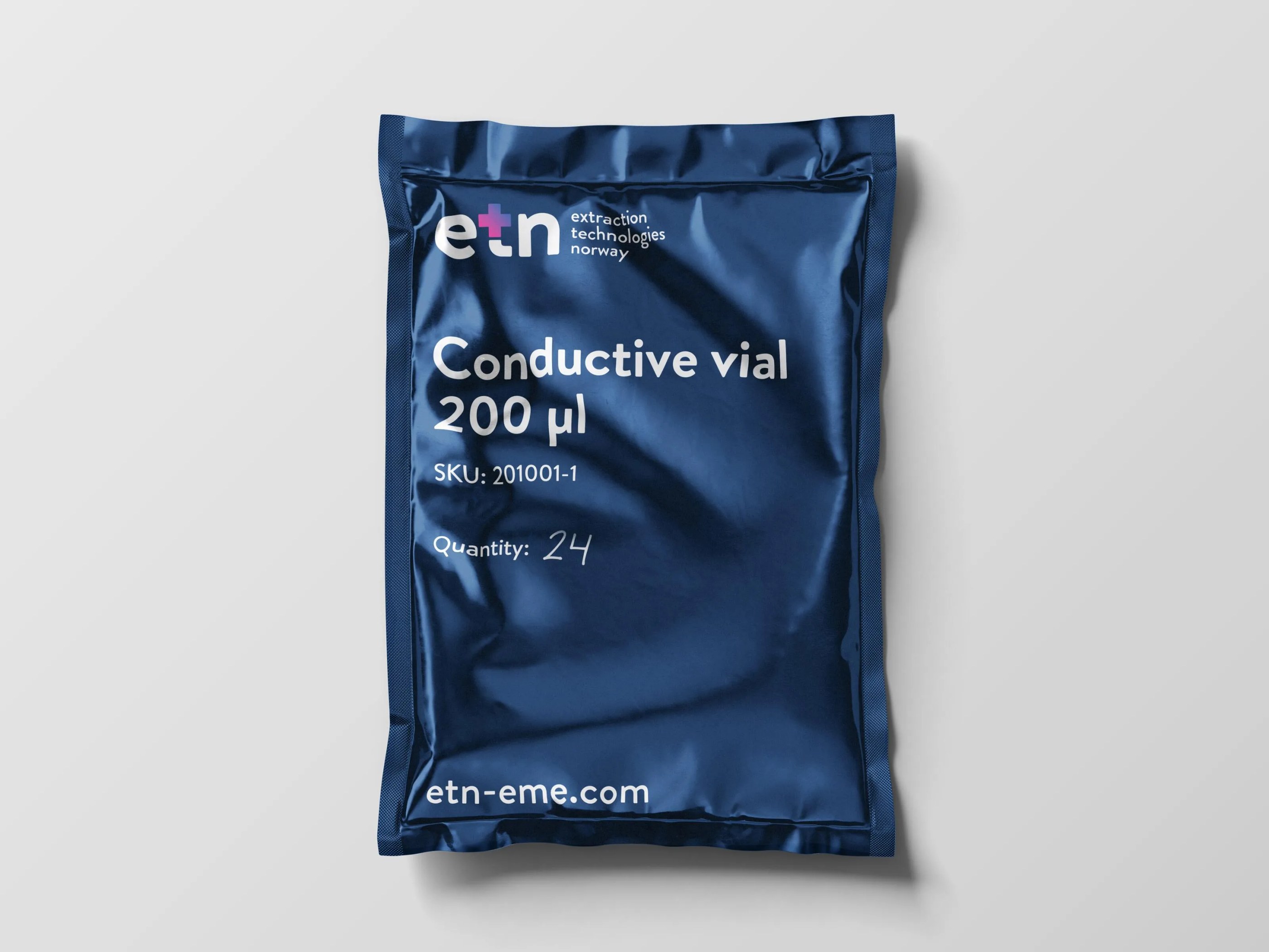
Beyond instruments and marketing, ETN required a packaging system for the consumables and starter kits that accompany the ETN-12 EME machine – including conductive vials, vial holders, unions, membranes and complete starter kits.
The packaging employs a clear information hierarchy – product type, volume and SKU details ensuring instant legibility on crowded lab shelves – whilst kraft cardboard boxes reinforce sustainability and metallic pouches protect sensitive components from moisture and contamination. Clean typography and minimal decoration maintain visual cohesion with the wider identity, showcasing ETN's ethos of precision, care and straightforward functionality, and supporting lab efficiency from unboxing through to extraction.

A Clean and Responsive Website
We developed ETN’s site on Webflow, and it offers a clean, responsive design that emphasises the brand. The homepage uses a clear grid and ample white space, guiding visitors through Technology, Products, Publications, and Company sections with sticky navigation and anchor links. Accent colours and subtle gradients reinforce the brand palette, while interactive hover states and selective micro-animations add polish without distraction.
The CMS (content management system) enables easy content updates and dynamic filtering of webinars, articles, and methods. Optimised images and tailored breakpoints ensure fast load times and readability across desktop, tablet, and mobile.
Overall, the site balances scientific credibility with approachable design, showcasing ETN’s technology on a seamless, maintainable platform.
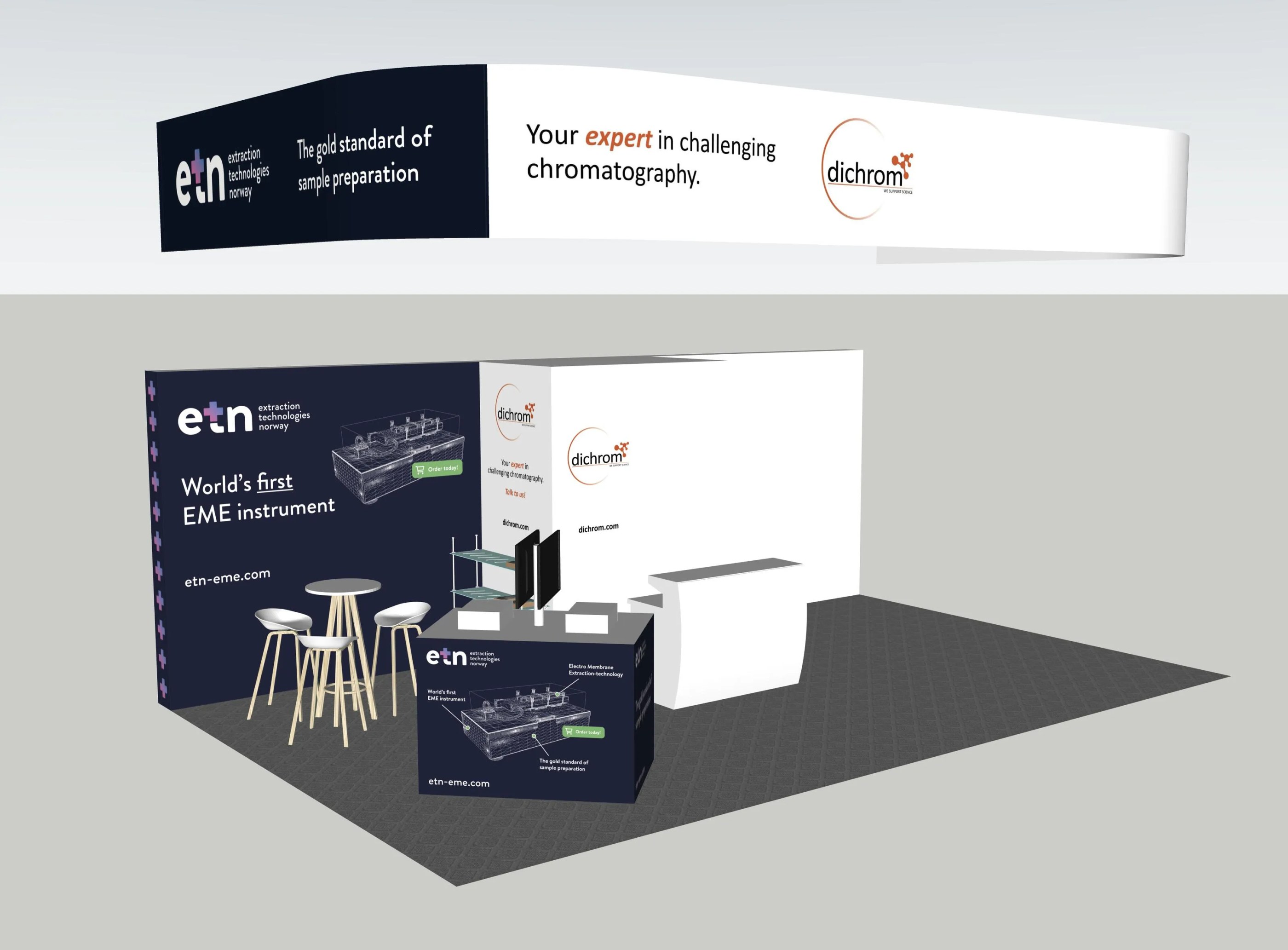

The 3D mockup vs. final stand from Analytica 2024. Dichrom acts as ETN’s distributor in EU, providing on-stand sales support and local market insight.
Stand-ing Out
ETN needed to cut through the visual noise at international trade shows – most notably Analytica in Munich and the ASMS Conference in Baltimore – and be instantly recognisable from across the hall.
For ETN’s debut at Analytica 2022 we created a compact, high-impact stand focused on introducing Electromembrane Extraction to a specialist audience seeing the technology for the first time. A brand coloured backdrop carried the new logo and “The gold standard of sample preparation” headline.
By Analytica 2024 the story had evolved from concept to commercial launch. We retained the core colour palette for brand continuity, but introduced full 3D renders and prototype instruments with dedicated demo benches that had animations of the coming software. Clear way-finding graphics (“World’s first EME instrument”, “The gold standard of sample preparation”) guided visitors through product, process and proof points.
Minimal furniture and a custom built demo bench kept the footprint open and approachable, encouraging hands-on conversations with early adopters and researchers. To reinforce ETN’s presence beyond the stand we created branded attire and giveaways that carried the identity into the aisles, turning visitors into mobile ambassadors.
Result
A cohesive visual identity and communication toolkit now position ETN as a credible, forward-thinking leader in sample preparation.
The unified colour gradient, approachable typography and illustrations flow consistently from website to trade show stands, branded apparel and giveaways, creating instant recognition at every touchpoint. Unlike most competitors in the industry – whose brands tend to lean more to the conservative and traditional visuals – ETN’s bold and vibrant identity sets them apart, instantly capturing attention and reflecting their innovative spirit.
ETN has begun shipping its first commercial EME instruments and is actively scaling production. The stronger market presence has also sparked collaborative research, revealing new application areas for Electromembrane Extraction in clinical diagnostics, environmental monitoring and pharmaceutical R&D, setting the stage for sustained growth and innovation.

ETN pre-launch teaser posters from Analytica 2022.
Creating Harmonising Visual Identities for UNOF and NUSO

Transforming Norli: Modernising an Identity with Timeless Roots

Perception vs. Reality: Making the Brand Match the Product

Where tradition meets modernity in construction branding

From Alternative Pedagogy to a Science-Based Learning Process

Website for chef Björn Svensson’s newest and final restaurant, FAN

Transforming the Alterna Interior Brand to the Nordic market
Creating Håvard the Mascot to Improve User Experience in Oslo City Forests
