

HealthPack
Perception vs. Reality: Making the Brand Match the Product

Aligning Digital and Physical Brand Experiences
HealthPack approached us when they realised their existing website and visual communication were not reflecting the true quality of their products. The site appeared cluttered and inconsistent, and the brand message failed to connect with their target audience.
Our task was twofold: to refine and strengthen the digital presence within the existing website platform, and to redesign the packaging to support the brand’s shift from online-only sales to retail display.
Our Approach
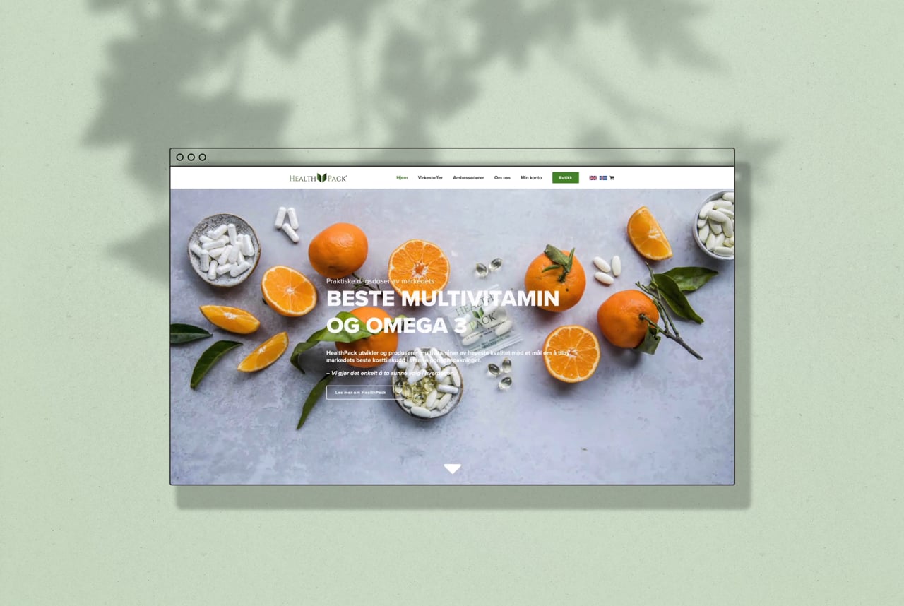
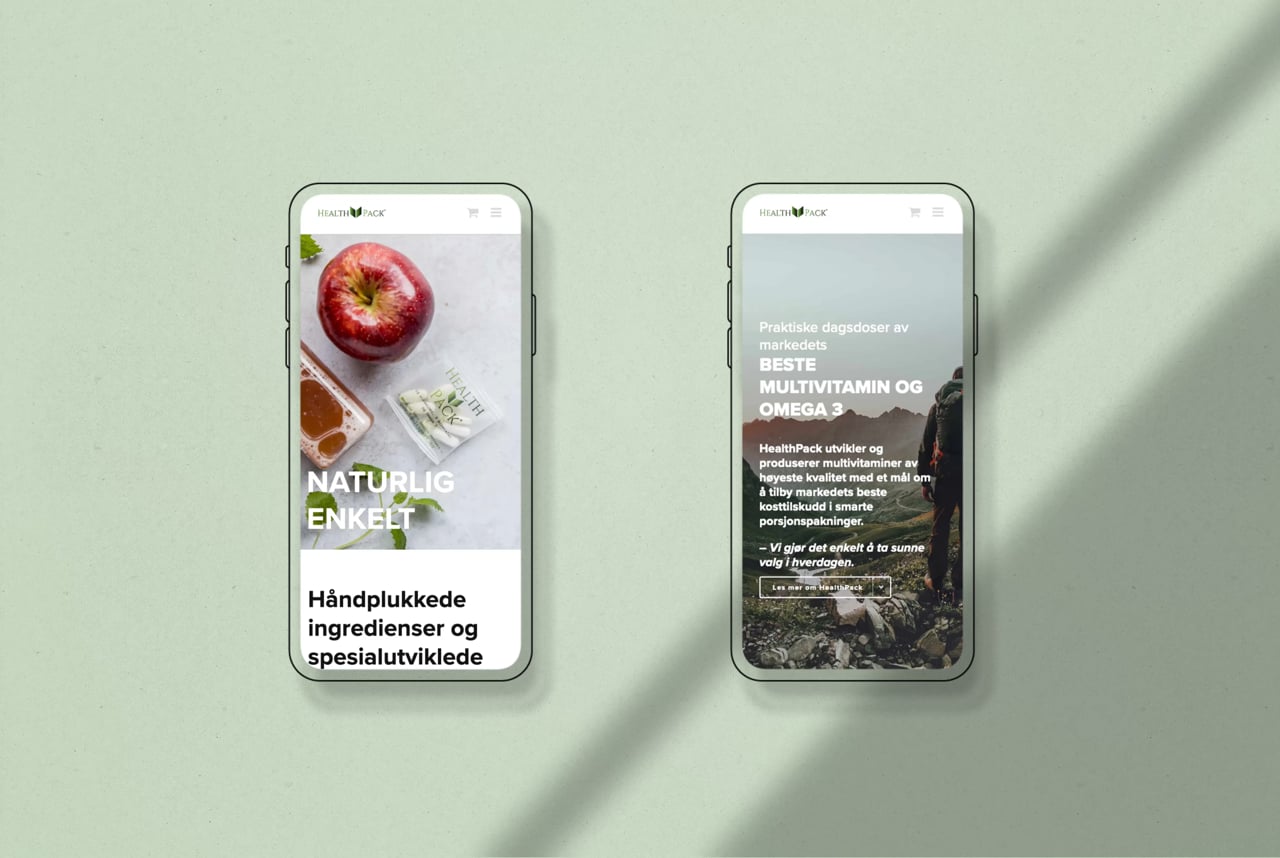
Our first step was to restructure the website content architecture. Given that the website serves as HealthPack's main selling platform, creating an effective digital presence was crucial to their commercial success. We created a more focused and engaging landing page supported by clear navigation pathways and direct calls to action, guiding visitors from discovery to purchase.
Working within the limitations of their existing theme and website platform, we introduced design adjustments to enhance perceived quality – tightening the typography, introducing a refined palette of natural greens, and applying consistent use of imagery inspired by health, freshness, and vitality.
Large, aspirational lifestyle photography was paired with strict typography. To complement this, we introduced a set of simple, informative icons that communicate product benefits clearly and effectively.


Branding for the Shelves
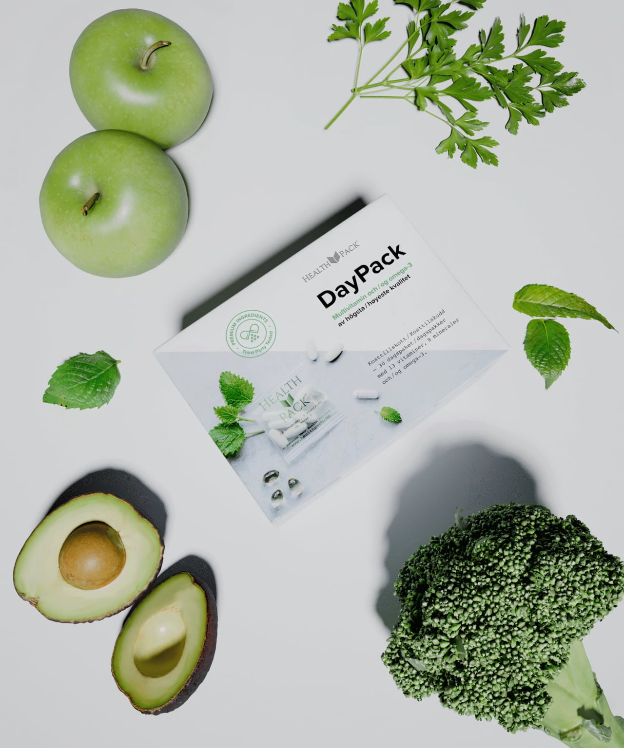
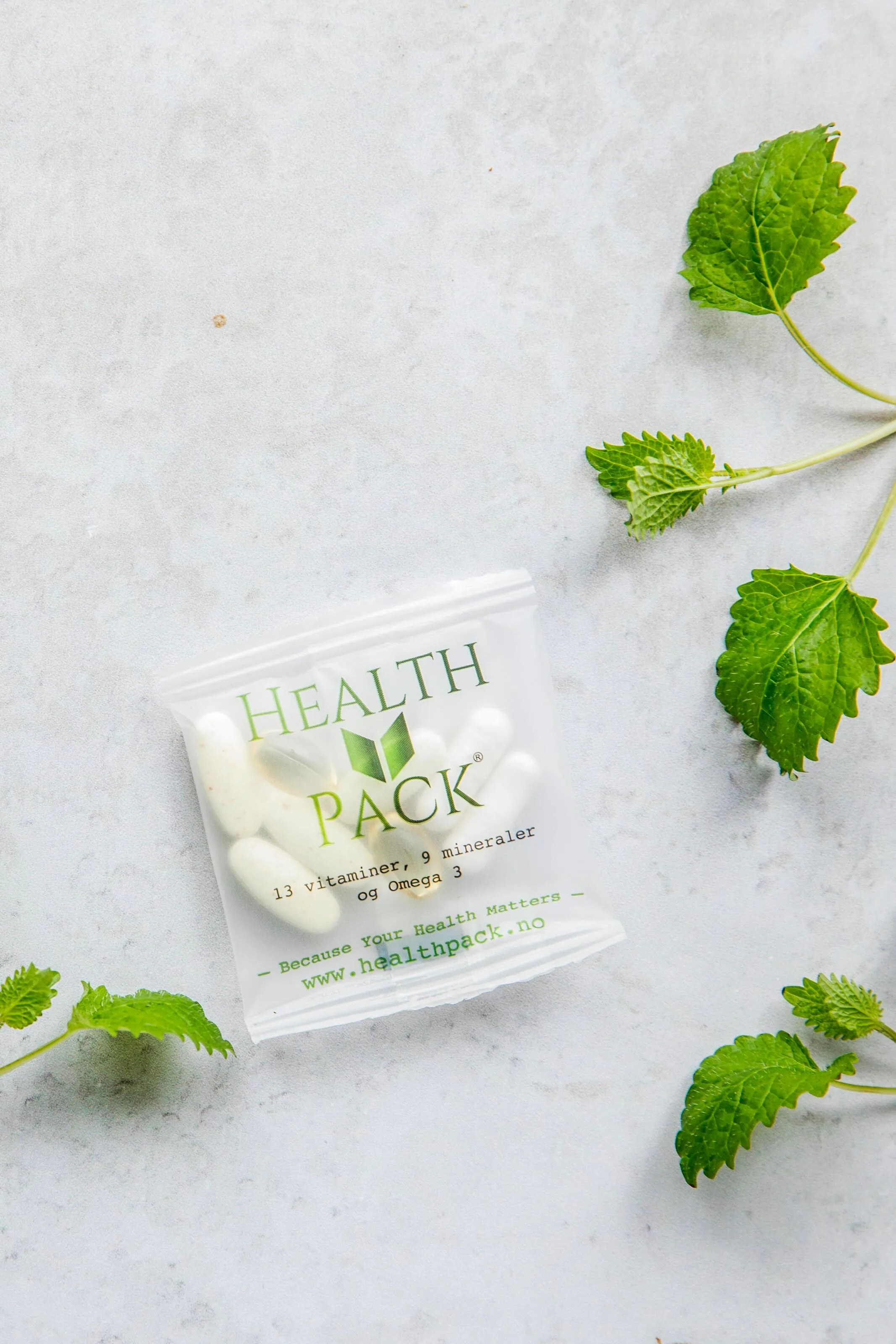
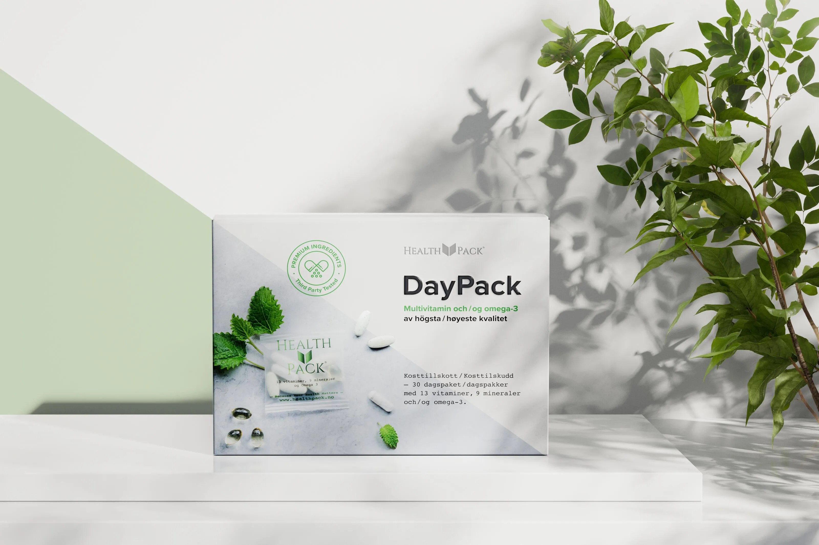
With the digital identity in place, we moved on to redesigning HealthPack's packaging. The goal was to create a visual and tactile expression of the product's premium qualities while ensuring strong shelf presence. This shift was particularly important as HealthPack is the only player in the market offering such smart daily portion packs – a unique positioning that needed to be clearly communicated at point of sale.
We introduced a distinctive slanted design element that serves as a visual divider between the product imagery and information. This angle became the key element of the new packaging identity. Premium materials and finishes, including embossing and silver foil, were used to underline quality and craftsmanship.
A significant design challenge was creating multilingual packaging solutions for HealthPack's Nordic markets. We developed two versions: a combined Norwegian/Swedish pack and an Icelandic/English version. Despite the linguistic similarity between Swedish and Norwegian, working with dual languages on the same packaging required careful consideration of text hierarchy and space allocation.
We developed the product name "DayPack" – a distinctive, memorable concept reinforcing the uniqueness of HealthPack's smart daily vitamin packs. Additionally, we created "MiniPack", a half-dose version designed for customers who find the full daily dose too much, ensuring the brand could cater to different consumer preferences whilst maintaining the packaging concept.

Premium Experience
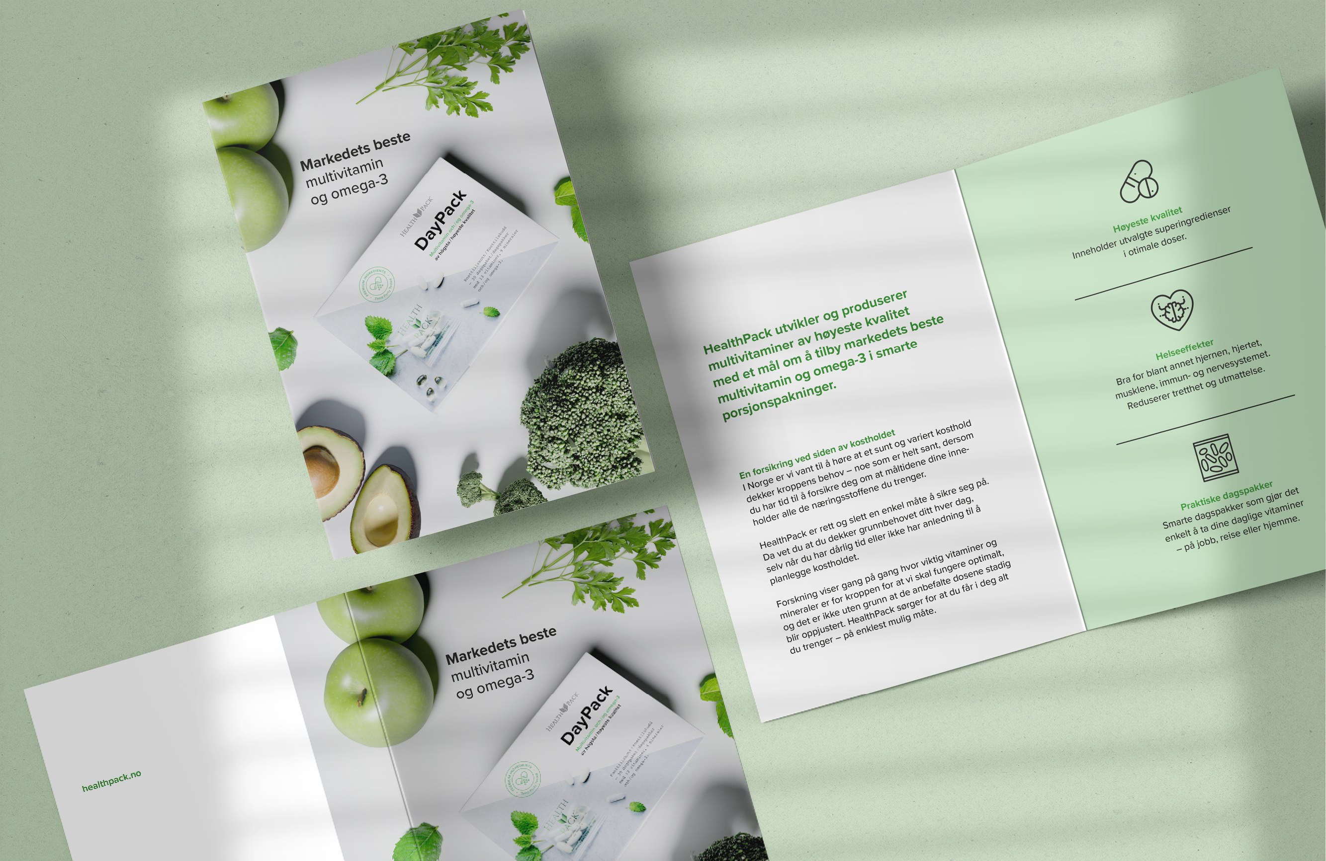
Beyond the core packaging redesign, we developed supporting collateral to enhance the customer experience and reinforce the premium positioning. A comprehensive product information brochure was created using the same visual language – clean typography, natural green palette, and the distinctive slanted design element. The brochure clearly communicates the benefits of each vitamin component, with dedicated sections for Magnesium, Multivitamin, and Omega-3, making complex nutritional information accessible and engaging for health-conscious consumers.
We also designed a thoughtful customer thank you card that extends the brand experience beyond the initial purchase. The card features lifestyle imagery of HealthPack products in their natural context, reinforcing the brand's connection to health and wellbeing. This piece serves as both a retention tool and brand reinforcement, demonstrating HealthPack's attention to customer relationship building whilst maintaining visual consistency across all touchpoints – from digital presence through to post-purchase communication.


Result
The result is a revitalised brand that now communicates its core values clearly: quality, health, and natural ingredients. The website is focused and user-friendly, effectively converting interest into action. The packaging design brings clarity, elegance, and distinctiveness to the shelves across three Nordic markets – perfectly aligned with HealthPack's ambition to grow as a premium health brand with flexible product offerings that meet diverse consumer needs.

Creating Harmonising Visual Identities for UNOF and NUSO

Launching the Gold Standard of Sample Preparation

From Alternative Pedagogy to a Science-Based Learning Process

Transforming Norli: Modernising an Identity with Timeless Roots

The Year of the Orchestras! Celebration, joy, and community combined in one identity
Creating Håvard the Mascot to Improve User Experience in Oslo City Forests

Transforming the Alterna Interior Brand to the Nordic market

Where tradition meets modernity in construction branding
