Montessori Norway
From Alternative Pedagogy to a Science-Based Learning Process

Shifting perceptions from "alternative" to reality: Research-Based Pedagogy
Montessori Norway approached us with a challenge: to redefine their public image and dispel misconceptions about their educational approach. Our task was to revitalize their visual identity and communicate clearly that Montessori is grounded in solid, research-based pedagogy.

Strengthen Montessori's reputation and brand in Norway
Montessori pedagogy adopts a holistic approach to learning, focusing on nurturing a child's innate curiosity and learning potential – and Montessori Norway is working hard to greater the interest in and understanding of Montessori pedagogy in Norway.
Montessori Norway approached us to develop an holistic visual identity based on their existing logo. Their goal was to convey a more professional organisation throughout their different communications, while also improving usability and efficiency. The task aimed to enhance clarity and increase impact, thereby strengthening Montessori's reputation and brand presence in Norway.
Their communication strategy sums it up: "From being an unknown and somewhat strange alternative pedagogy, Montessori will become an exciting view of learning, known to high-quality schools and kindergartens."


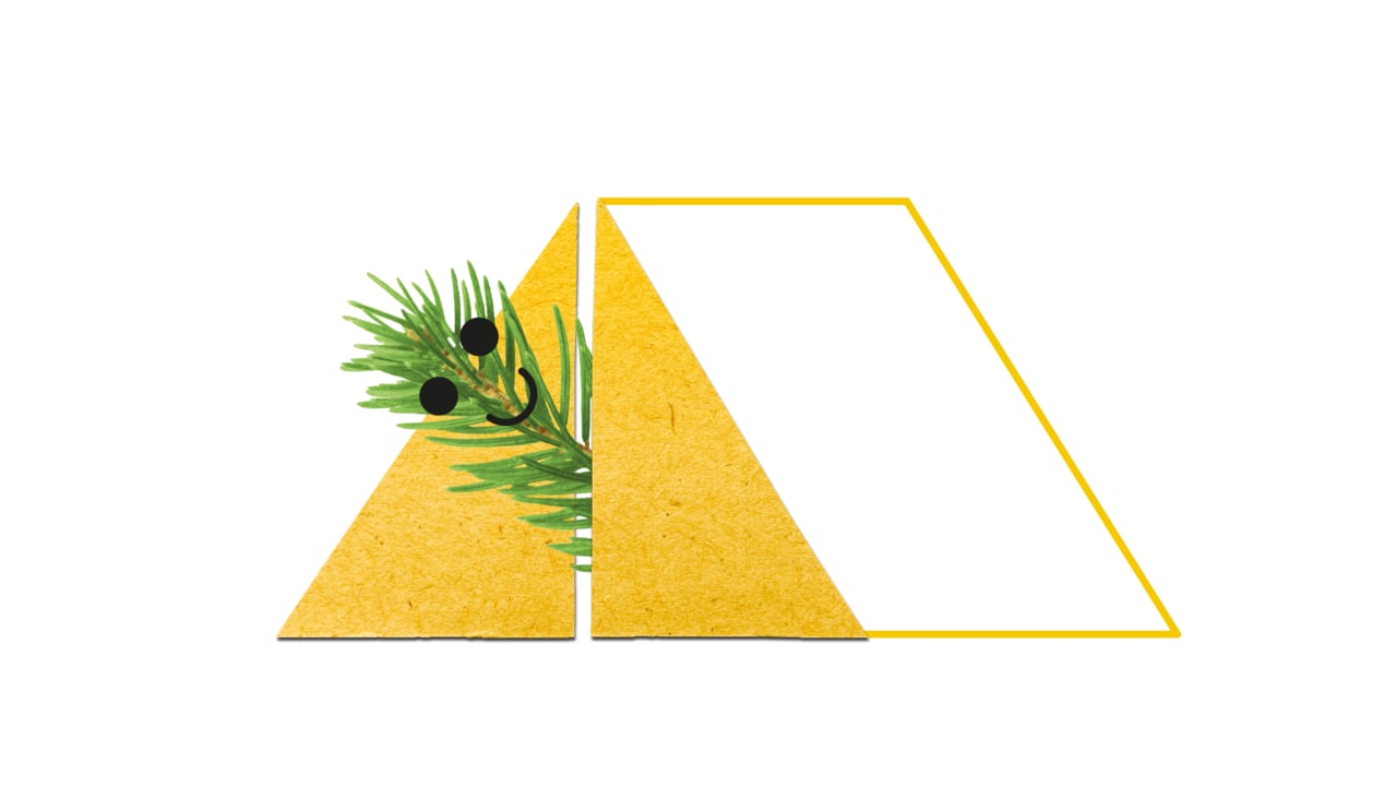
Tote bag design and poster make use of the "Montessori Arrow" – used as a image frame on the poster.
We are very pleased with the collaboration. We will certainly continue to work together with WeForm in the future. They are friendly, efficient and listens to our needs.


Editorial design for curriculum books, focusing on enhancing user experience through providing a clear structure and easy navigation.
Tailoring teaching to each individual student
The target audience consisted of educators, leaders, and parents in schools and kindergartens. A key objective was to create a visually clean and organised aesthetic that reflects the essence of Montessori.
The design aimed to embody important concepts such as "future-oriented," "research-based," and "sustainable." In line with this vision, the design intentionally removed the triangle or arrow element from the logo, emphasizing versatility and adaptability. This flexibility allows for diverse applications and scalability, enabling the client to develop their own communications and magazines using the provided templates.

A new colour palette was crafted, building upon an existing one, but with the addition of softer tones to achieve a fresh and gentle aesthetic. To create a spacious and airy feel, a grid system with generous margins was implemented, allowing ample room for impactful imagery and illustrations. By combining the arrow symbol with images of individuals or Montessori teaching tools, and organising them within a clean grid layout, the design effectively conveys a narrative of both structure and human connection.
In addition to developing the visual identity, a range of templates were created for brochures, posters, presentations, and merchandise, ensuring consistency across various communication materials. Furthermore, a comprehensive curriculum was meticulously designed and developed to meet the project's requirements.
Our curriculum, which is a large and comprehensive document, has become much more user-friendly in addition to great to look at. There are so many appropriate and smart design solutions, which really support the entire content of the plan in an excellent way. We have received exclusively positive feedback!


Launching the Gold Standard of Sample Preparation

Clear, Warm, and Professional Healthcare Branding

The Year of the Orchestras! Celebration, joy, and community combined in one identity
Creating Harmonising Visual Identities for UNOF and NUSO

Transforming Norli: Modernising an Identity with Timeless Roots

Website for chef Björn Svensson’s newest and final restaurant, FAN

Transforming the Alterna Interior Brand to the Nordic market