

Norli
Transforming Norli: Modernising an Identity with Timeless Roots

Passion for books since 1890
Norli boasts high customer satisfaction, strong loyalty, and continuous growth. However, the brand lacked a robust, recognisable, and cohesive visual identity that could also convey its unique history and competitive advantages. Norli sought a partner to assist in developing this, turning to us at WeForm for collaboration.

One of the World's Best Bookstores
Norli is a genuine bookstore – actually one of the world's best. Nominated for the Best International Bookstore at the London Book Fair 2022, Norli's store in Universitetsgata, Oslo, stands out for its exceptional service, the largest book selection, and related products. However, a lingering perception of being more expensive than competitors posed a problem for the chain.
While having a well-established target audience (60+), and major book readers, Norli aimed to appeal to a younger market, shedding the image of a somewhat conservative and old-fashioned bookstore. Many stores underwent interior redesigns for a fresher, more authentic appearance, featuring inviting tall bookshelves with ladders. However, the visual identity lagged behind. Marketing materials and communication were inconsistent, lacking cohesive elements in terms of typography, colours, or styles. The expression felt messy, unclear, and 'too cheap/somewhat circus-like' – their history, knowledge, and service/product did not shine through.
After a thorough analysis of the brand and its competitors, it became clear that visual communication needed to be cleaned up. Our task was primarily to unify the expression, create a more modern identity, and present 'good deals and prices' in a clear and organised manner. Their history needed more emphasis—the authentic Norli had to come forward.

An authentic and genuine history, great service, and affordable products – all in one identity
The 'Main DNA' of Norli (logo and main colour) needed to remain recognisable as the brand was well-established with high customer satisfaction and loyalty. Still, adjustments were required to modernise and reach a younger audience (35+). We opted to modernise the logo/wordmark with subtle changes, removing the outdated and redundant oval shape.
The logo redesign aimed to maintain recognition while optimising it. The lead version of the Caslon font served as a starting point for a round and friendly expression. Certain details from the previous logo were retained to make it more individual and distinct. Contrast was optimised for effectiveness in both large and small sizes.


The final version of the Norli wordmark was hand-drawn by Store Norske Skriftkompani.
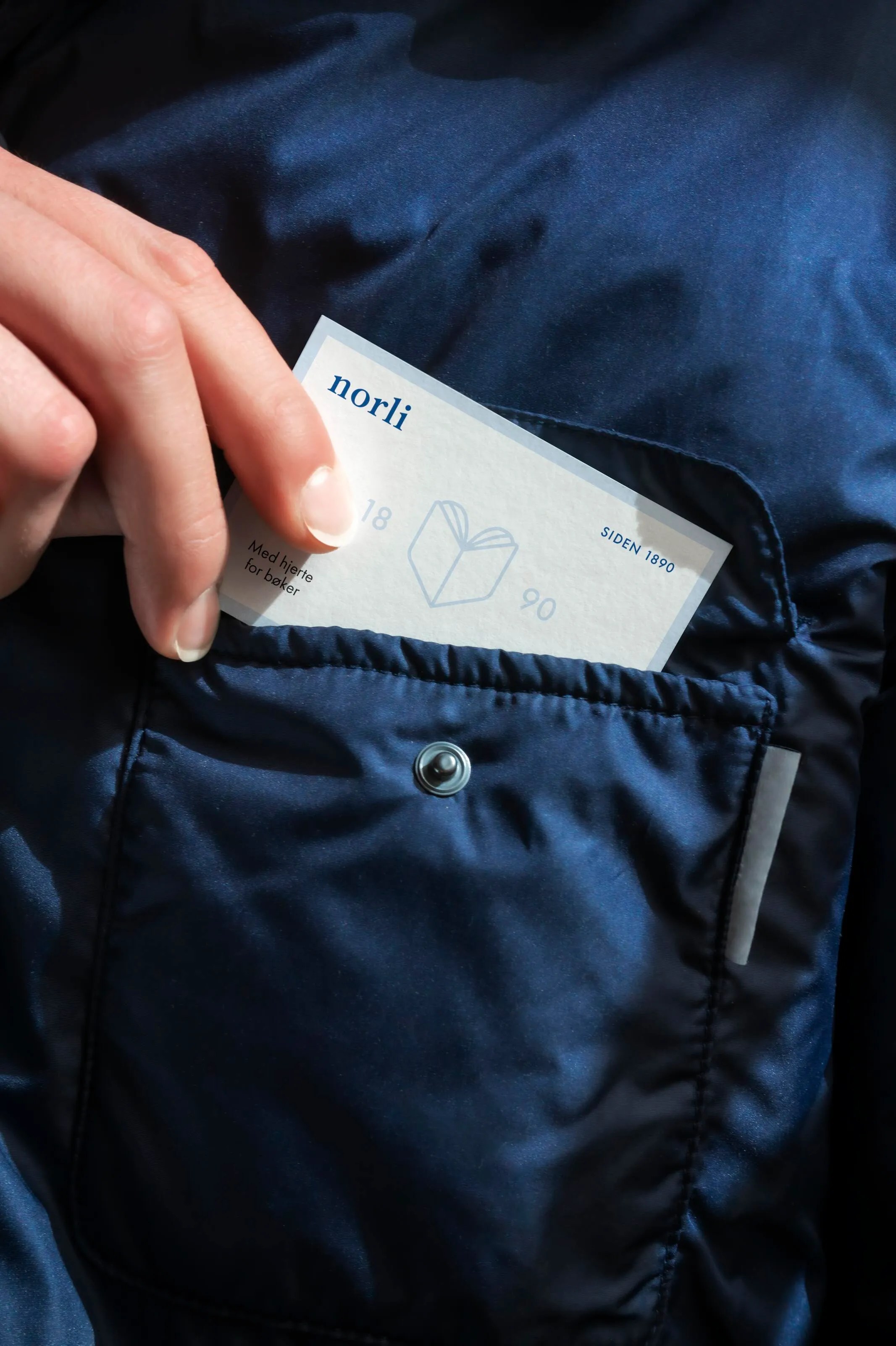
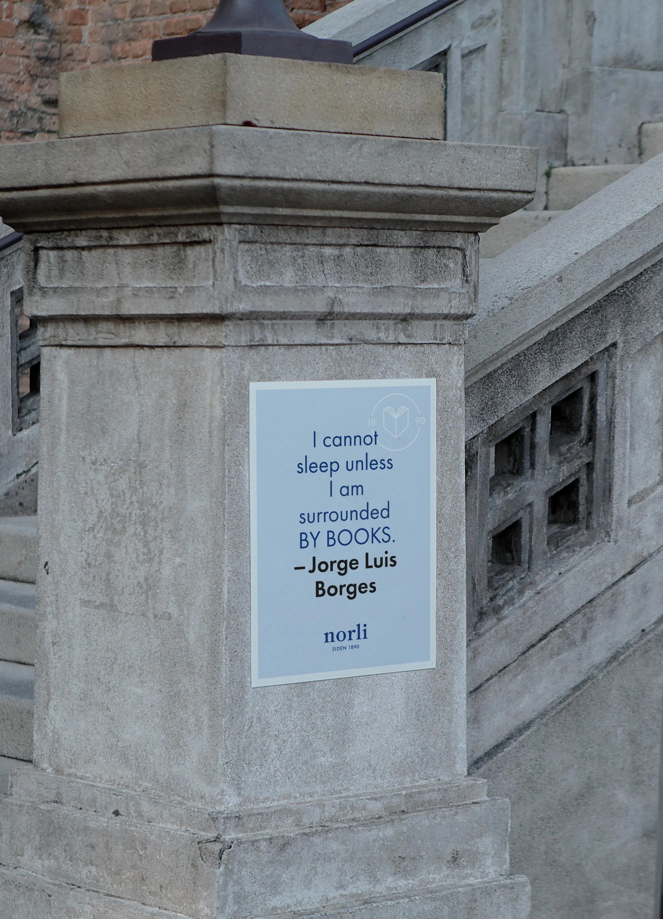
A logo with a subtitle is used where appropriate, preferably as much as possible. “Since 1890” is a crucial part of Norli's history, reinforcing the image of being the leading and authentic bookstore. It provides a sense of solidity and tradition valuable for brand building.
To further strengthen the brand’s heritage, we developed a logo version featuring a new symbol combined with a payoff. The symbol illustrates the back of a book, where the open pages together form a heart shape – paired with the tagline (translated to English) “With a heart for books – since 1890.” This logo variation adds a sense of tradition and communicates Norli’s story and passion even more clearly. The symbol can be used flexibly across different applications, serving as a distinctive decorative element that enhances variety and depth in visual communication.


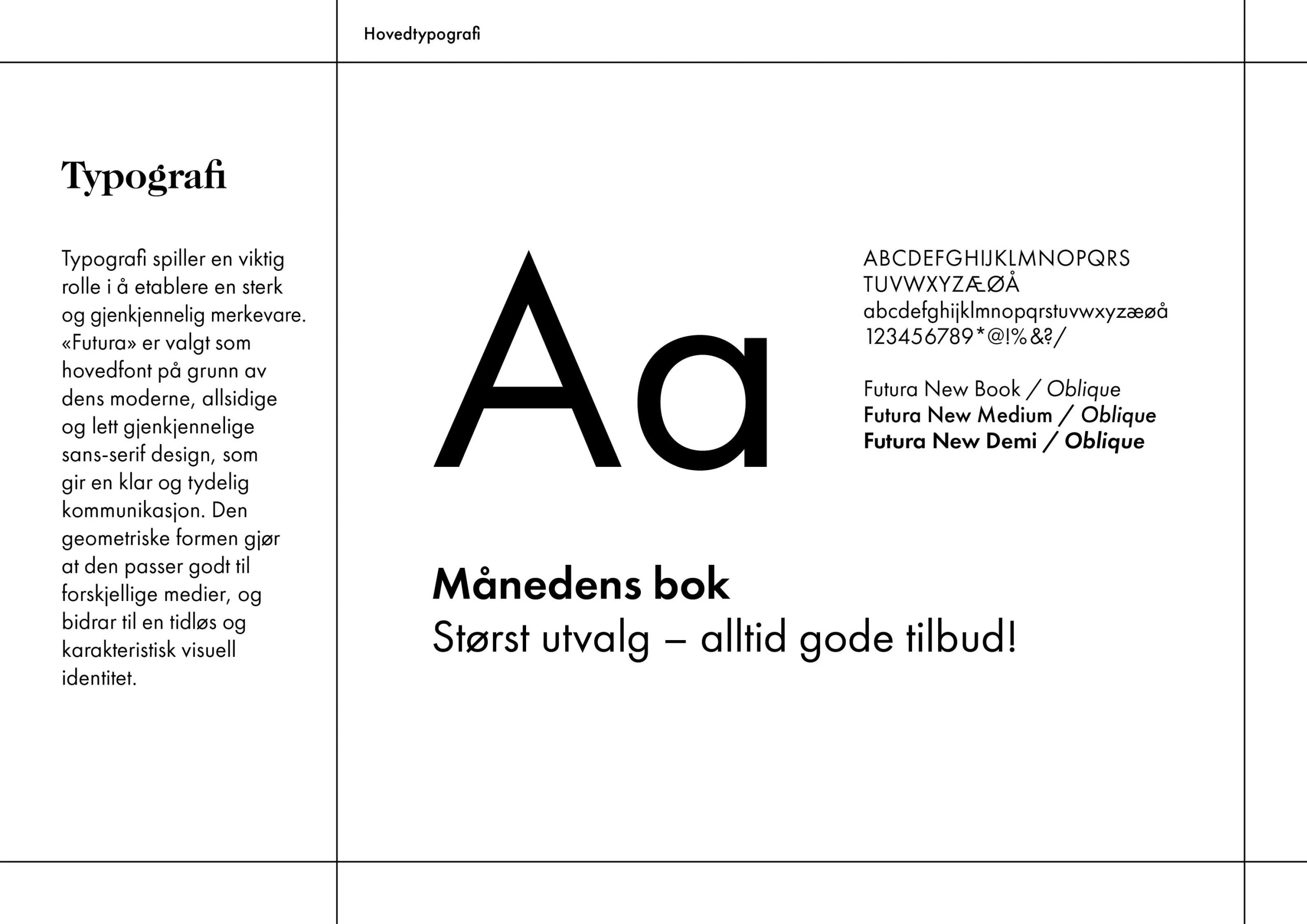
A fresher colour palette and cleaner typography were established as foundational elements in the identity. 'Futura' was chosen as the main font for its modern, versatile, and easily recognisable sans-serif design, facilitating clear communication. Its geometric shape makes it suitable for various media, contributing to a timeless and distinctive visual identity.
In our collaboration with WeForm, we value being able to get straight to the heart of the issues quickly, without too many detours. We work directly with one highly competent person, who brings in additional expertise only when necessary. We are extremely pleased with both the process and the outcome.


We recognised that posters and signage should be a 'pause' in the visual noise in stores and designed them with cleaner/calmer templates. This resulted in them being more prominent, and information and prices became clearer. We aimed for all in-store communication to complement each other, side by side, rather than compete.

BEFORE and AFTER: In-store transformation. The posters create visual oases amid the noise, offering natural resting spots for the eye.
WeForm is efficient, professionally strong, and an excellent discussion partner. They provide clear advice and recommendations, have an outstanding aesthetic sense, and are quickly able to identify directions that align with our vision. We have had many “aha” moments throughout our collaboration.

Norli operates over 190 stores across Norway, many with different architecture and layouts. Several locations needed decorative window films to cover large walls or glass areas, often due to cluttered or distracting interiors. The challenge was to create something that both elevated the environment and reinforced the brand.
We collaborated with illustrator Lina Raknes to develop a series of illustrations aligned with the new identity – capturing the joy of reading in a playful and inspiring way.


Everything from the core elements like logo, colours, and typography to other exposure surfaces like posters, bags, and social media has been redesigned and anchored in a design manual.
We are extremely satisfied with the outcome and find that the design works just as well in physical shops as on digital platforms. We now have a unified profile that provides a solid foundation for future development. Feedback has been very positive from both staff and customers.


Launching the Gold Standard of Sample Preparation

From Alternative Pedagogy to a Science-Based Learning Process
Creating Harmonising Visual Identities for UNOF and NUSO

Transforming the Alterna Interior Brand to the Nordic market
Creating Håvard the Mascot to Improve User Experience in Oslo City Forests

The Year of the Orchestras! Celebration, joy, and community combined in one identity

Where tradition meets modernity in construction branding

Perception vs. Reality: Making the Brand Match the Product
