

Orkesteråret
The Year of the Orchestras! Celebration, joy, and community combined in one identity

Overview
Founded on April 20, 1974, the Youth Orchestra Association (UNOF/De Unges Orkesterforbund) celebrated its 50th anniversary in 2024. This milestone required engaging all UNOF members, as well as everyone involved in orchestral music across Norway and their partners both nationally and internationally. As part of the celebration, we developed the concept and identity for this special year long event, creating a visual expression that captures the spirit of celebration whilst fostering pride and community among orchestra musicians.

Ensemble!
The anniversary celebration aimed to highlight UNOF as an organisation and celebrate the work done for the children's and youth orchestra sector in Norway. In addition, we wanted to foster a sense of pride and community among orchestra musicians whilst promoting even more joy in playing music.
Our goal was to make the orchestra scene in Norway more accessible to the public, aiming to reach a larger and more diverse audience than ever before. The Orchestra Year 2024 would help spark musical harmony among both performers and audiences through concerts and various projects.


How to Show that Everyone Can Play in an Orchestra
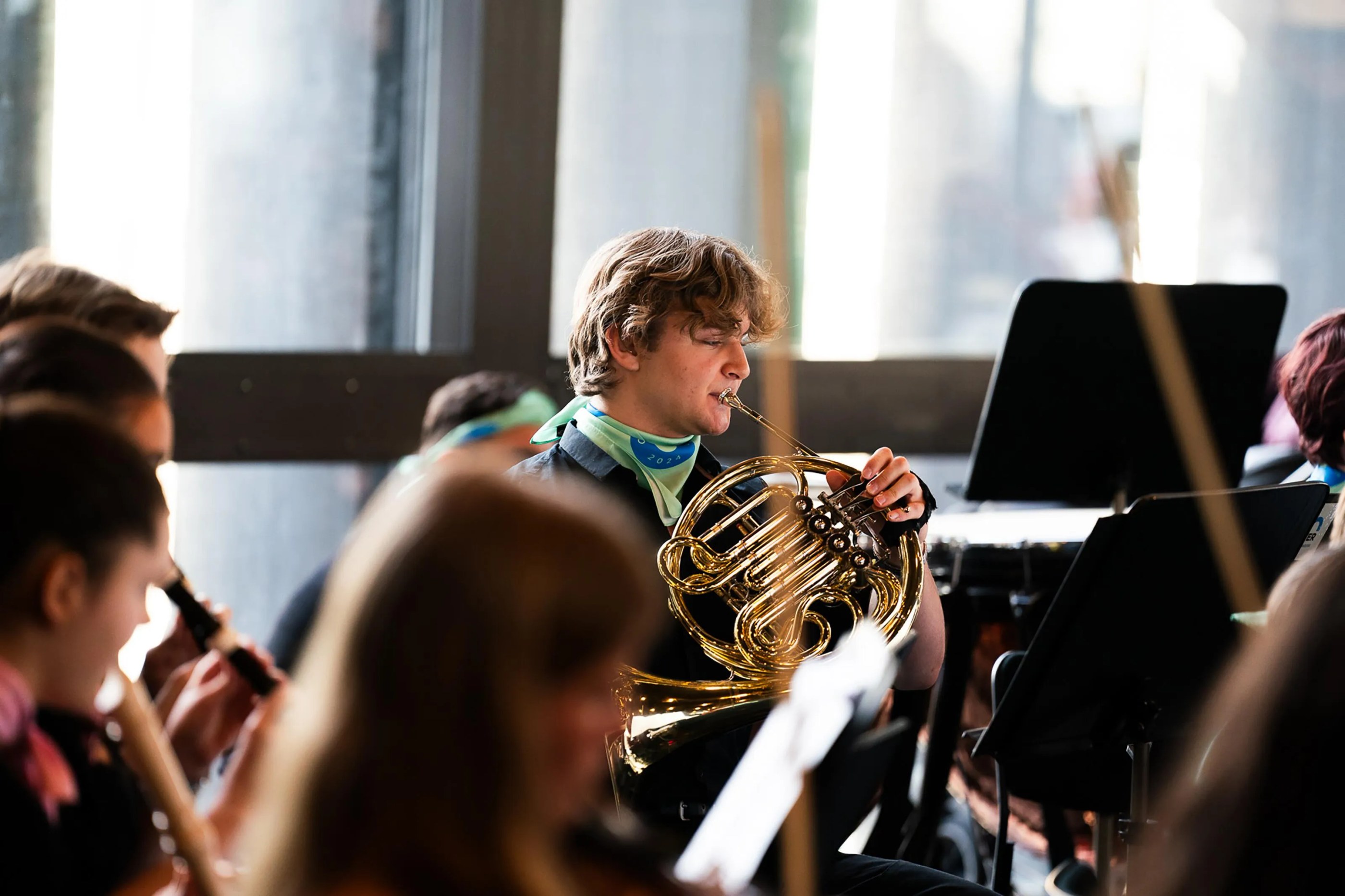
Diversity, community, and the joy of music! These core values would raise awareness that orchestras are not elitist; they are cool and for everyone! We intentionally moved away from the "typically classical" look – with dark colours and a somewhat formal expression. Instead, we focused on the strong sense of community and the social aspects of playing in an orchestra, particularly emphasising the people, especially the children, within the orchestras.
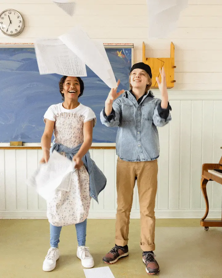
To support this vision, we organised a photoshoot with photographer Rebecca Zeller to highlight the everyday joys and camaraderie of orchestra life.

Recognition and Versatile Elements as a Base
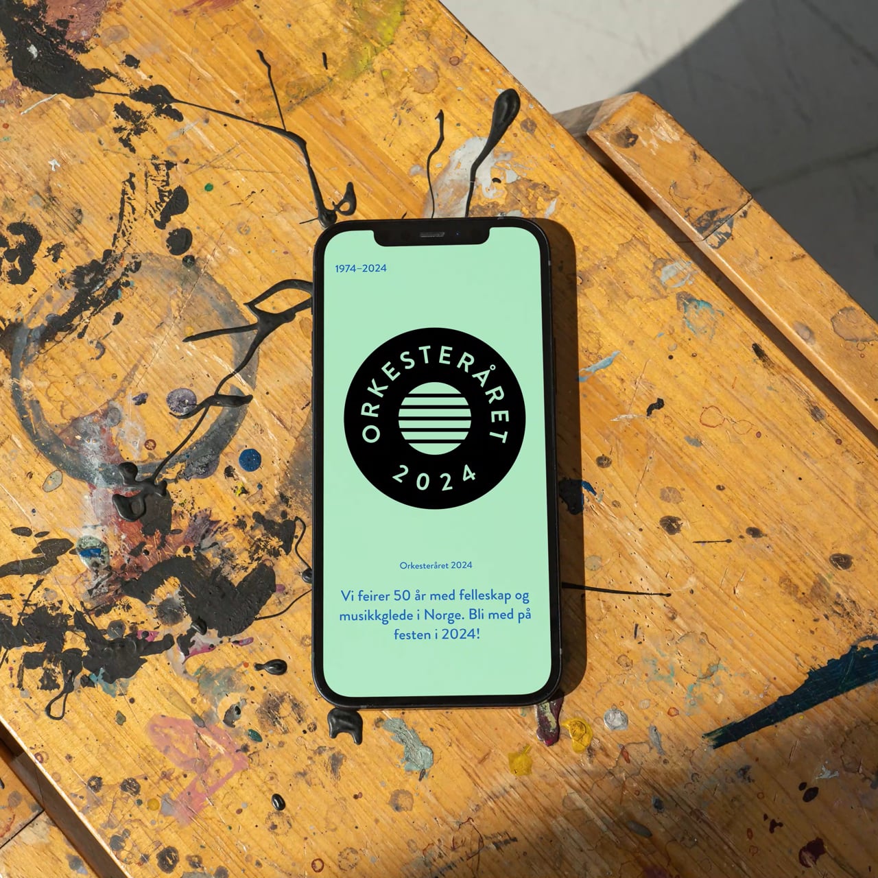
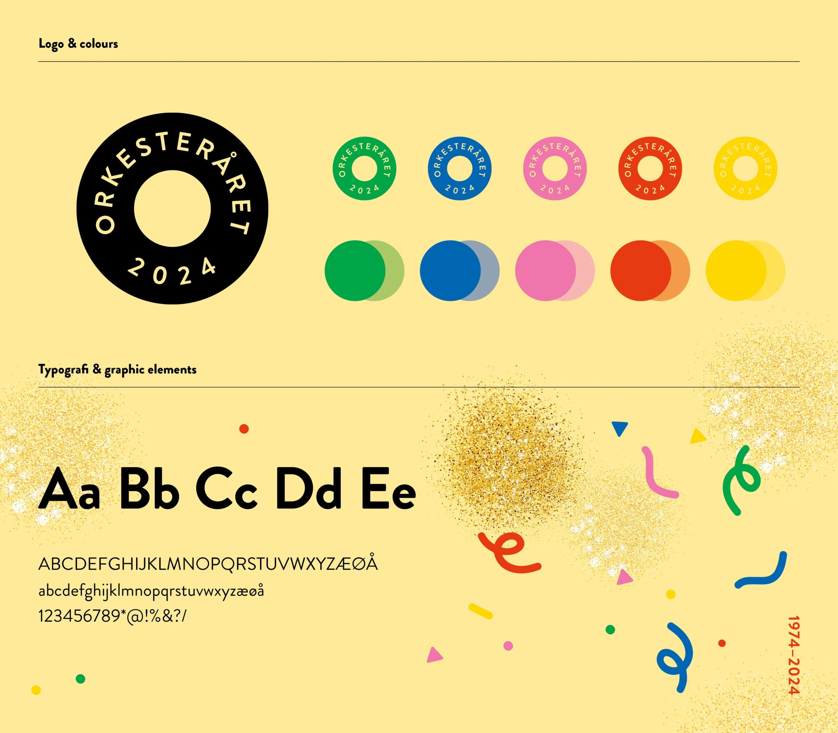
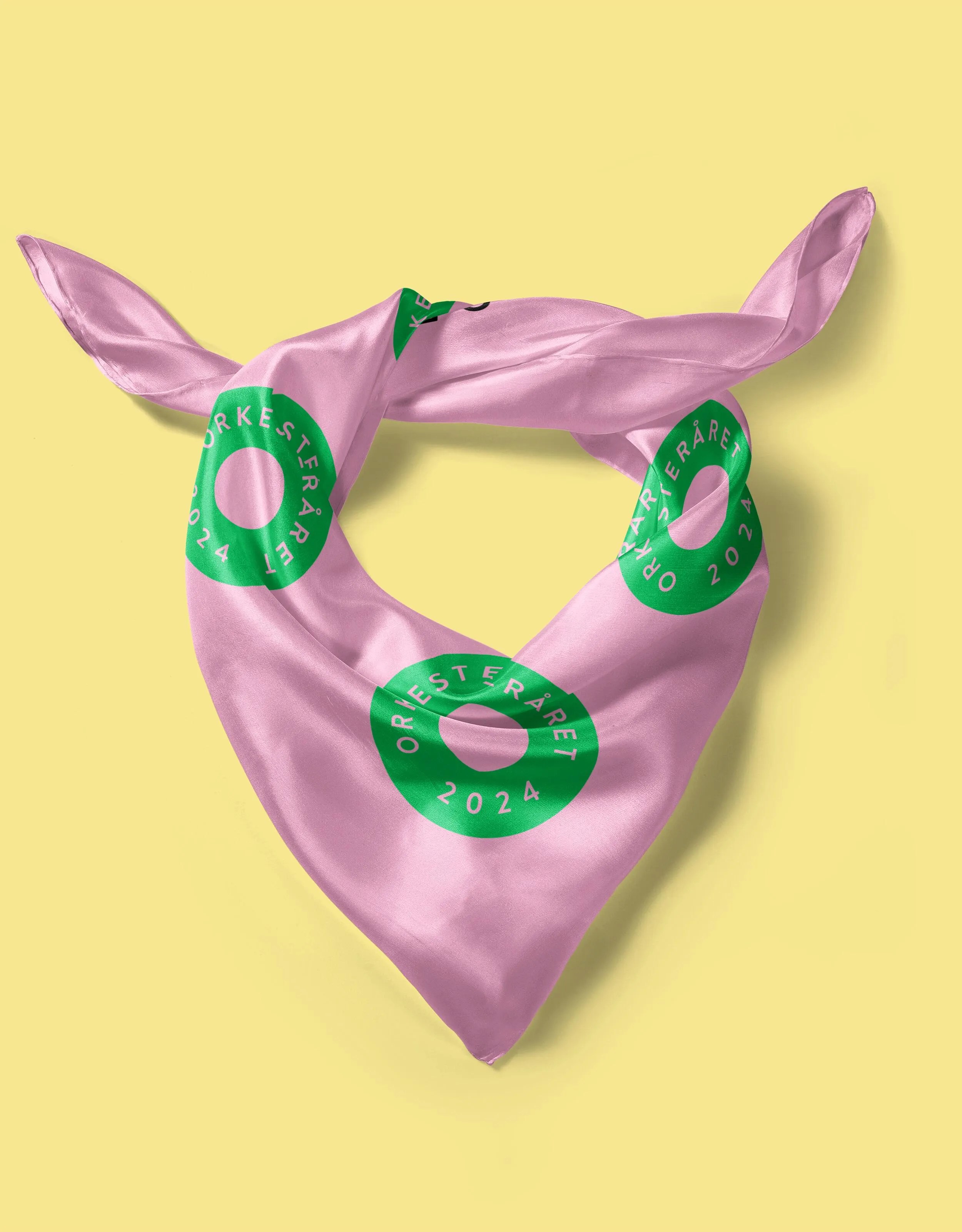
We further developed the visual identity, drawing on UNOF's existing identity to create recognition for those behind the celebration, ensuring that our communication remains cohesive. The logo is designed in a circle – an "easy" shape that is both clear and versatile, evoking associations with music, instruments, and notes. It's playful and adaptable, allowing for expansion into animations.
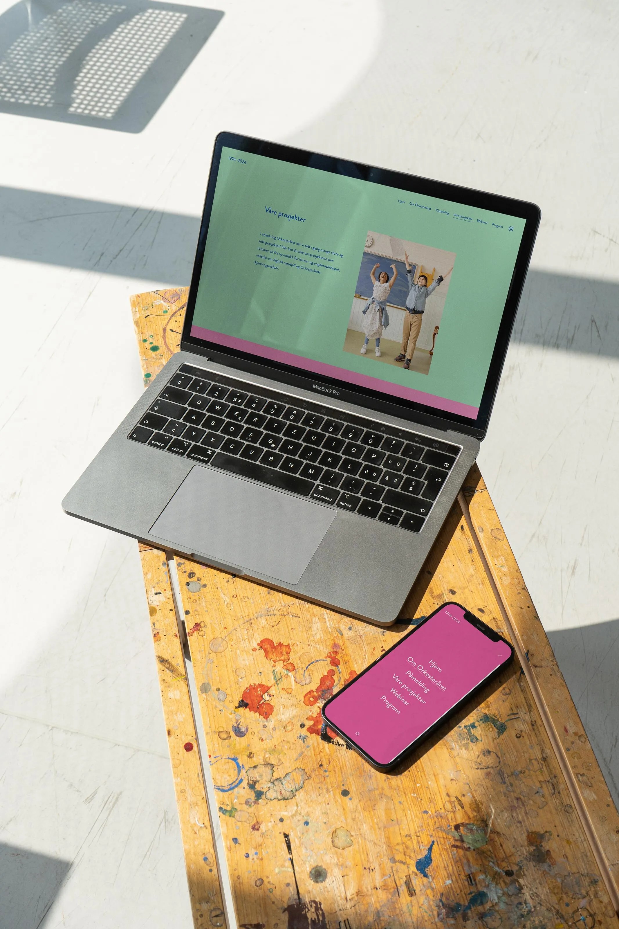
A varied colour palette, combined with confetti and glitter graphics, enhances the identity, creating a playful and festive atmosphere. In addition to the visual identity, we developed a website, along with templates for posters, invitations, roll-ups, social media, and merchandise/clothing. Both children and young members were actively involved in developing the new identity, which was essential for achieving a cohesive and successful result.


We intentionally moved away from the "typically classical" look – with dark colours and a somewhat formal expression. Instead, we focused on the strong sense of community and the social aspects of playing in an orchestra, particularly emphasising the people, especially the children, within the orchestras.


Result
The Orchestra Year 2024 identity successfully captured the celebratory spirit of UNOF's 50th anniversary whilst breaking away from traditional classical music aesthetics. The vibrant, playful visual language resonated strongly with members, particularly the youth, who embraced the fresh approach to orchestral identity. The versatile design system – from logo to confetti graphics – provided flexibility for various applications, from digital platforms to merchandise, ensuring consistent and engaging communication across all touchpoints.
The photoshoot with Rebekka Zeller brought authenticity to the identity, showcasing the real joy and community spirit within the orchestras. This human-centred approach helped communicate that orchestras are accessible and welcoming spaces for everyone, challenging preconceived notions about classical music being exclusive or elitist.
The comprehensive toolkit of templates and materials enabled UNOF to maintain a cohesive visual presence throughout the anniversary year, whilst the website served as a central hub for celebrating achievements and engaging both members and the broader public.
We are very pleased with the profile WeForm created for the Orchestra Year! Just the other day, I overheard someone say it's the coolest logo they've ever seen. The colours are vibrant and highly visible.
The project successfully created a sense of pride and belonging among orchestra members whilst making orchestral music more approachable and accessible to a wider audience, setting a new standard for how youth orchestras can present themselves with energy, warmth, and inclusivity.


Creating Harmonising Visual Identities for UNOF and NUSO

Transforming the Alterna Interior Brand to the Nordic market

Where tradition meets modernity in construction branding

Transforming Norli: Modernising an Identity with Timeless Roots

From Alternative Pedagogy to a Science-Based Learning Process

Website for chef Björn Svensson’s newest and final restaurant, FAN

Perception vs. Reality: Making the Brand Match the Product
Creating Håvard the Mascot to Improve User Experience in Oslo City Forests
