

Restaurant FAN
Website for chef Björn Svensson’s newest and final restaurant, FAN

A Michelin Legacy in a Nordic Setting
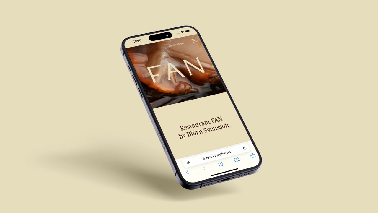
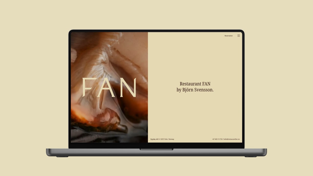
FAN is a culinary destination that embodies his distinctive take on Nordic cuisine and uncompromising quality. The site’s design extends the restaurant’s refined and modern atmosphere into the digital realm, offering visitors an experience that is as elegant as it is intuitive.
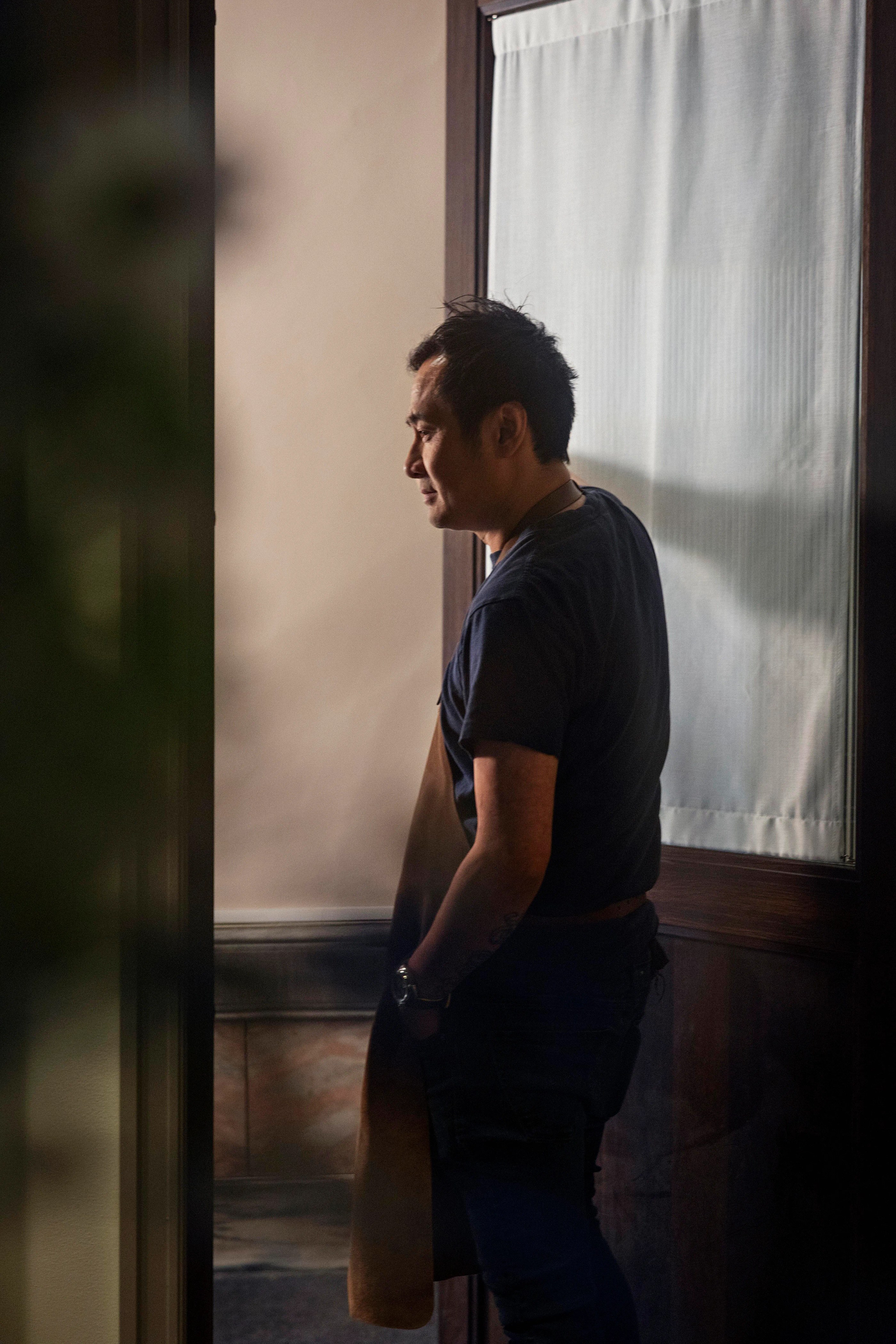
Housed in a classic Frogner apartment with Nordic-inspired interiors, FAN is Svensson’s fifth restaurant – and, as he says, his last. With Michelin stars from Oscarsgate, Fauna, Galt, and Schlägergården already under his belt, his ambition remains to deliver unforgettable dining experiences in Oslo. The restaurant has been warmly received by critics, praised for both its culinary artistry and its intimate setting.
Branding and Visual Identity
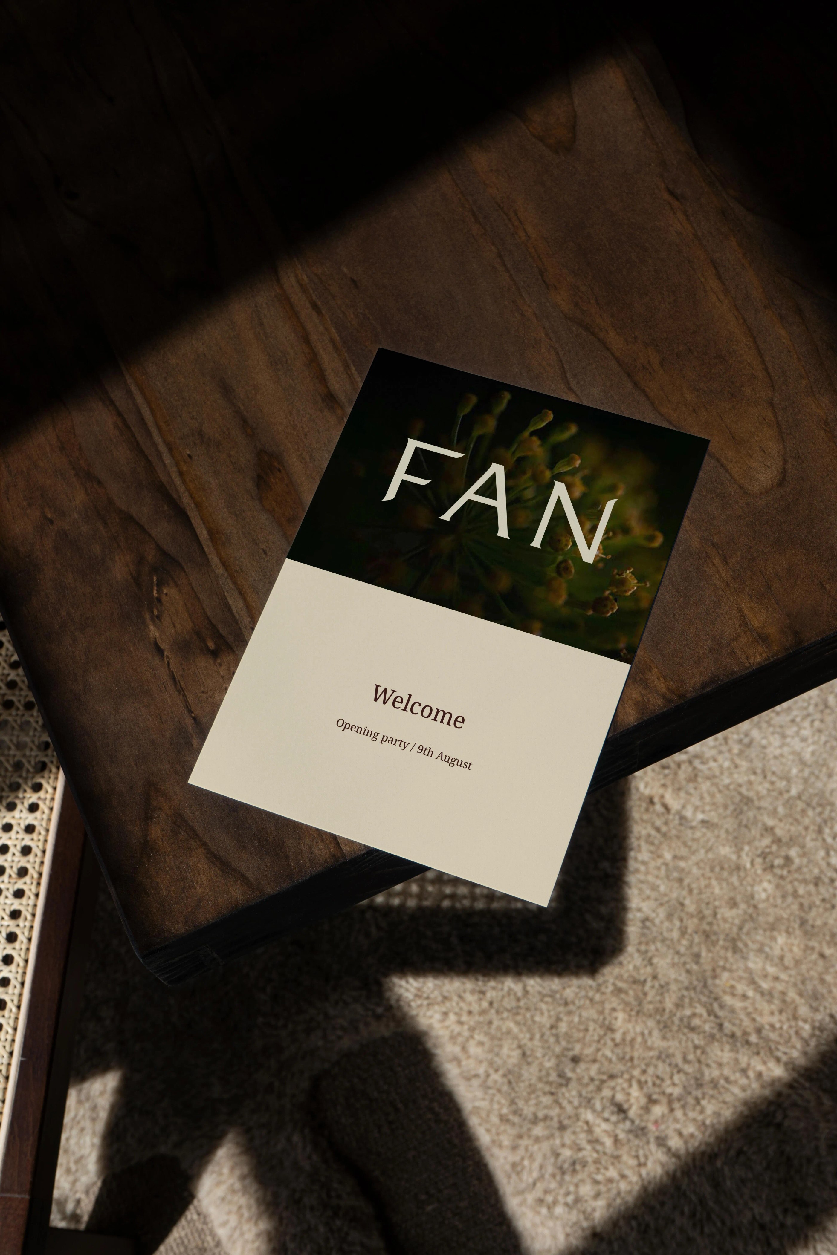
The logo was created by Studio Pfanzelter, with whom we collaborated closely to expand the visual identity and branding elements. Photography of the interiors and dishes was provided by Sune Eriksen, whose imagery plays a central role in the site’s storytelling.
The website’s visual direction is built on clean lines and a minimalist aesthetic, with a colour palette inspired by the Nordic landscape. Full-screen photography highlights signature dishes and the restaurant’s sophisticated interior, offering visitors a taste – both literal and visual – of what awaits them in person.

User-Friendly by Design
Ease of navigation was a key priority. The site provides clear access to essential information such as menus, opening hours, location, and reservations, all available from any page. A fixed “Reserve” button is strategically placed to streamline the booking process.Responsive design ensures optimal performance on all devices – from mobile phones to large desktop screens – recognising that many guests discover and book restaurants while on the go.
Effortless Updates
With FAN’s focus on seasonal ingredients, the site was built with a flexible content management system, enabling the team to easily add or update menu items and content. This ensures both the restaurant and the website stay relevant and fresh throughout the year.
Optimised for Visibility and Speed
We implemented SEO best practices to help FAN rank highly in relevant searches, making it easier for potential guests to find the restaurant online. All images and content were optimised for fast loading, enhancing both user experience and search engine performance.

Should you try Björn Svensson's new restaurant? Hell yes, you should!

Result
The new Restaurant FAN website delivers a cohesive brand experience that informs, inspires, and entices visitors to book a table. Through a blend of elegant design, user-focused functionality, and technical precision, the site reflects the restaurant’s philosophy – refined, modern, and memorable.


The Year of the Orchestras! Celebration, joy, and community combined in one identity

From Alternative Pedagogy to a Science-Based Learning Process

Launching the Gold Standard of Sample Preparation

Creating Harmonising Visual Identities for UNOF and NUSO

Transforming Norli: Modernising an Identity with Timeless Roots

Transforming the Alterna Interior Brand to the Nordic market
Creating Håvard the Mascot to Improve User Experience in Oslo City Forests

Clear, Warm, and Professional Healthcare Branding
