

Snekra
Where tradition meets modernity in construction branding

Building a Solid Future with a Modern Brand Identity
Snekra brings together over 40 years of combined experience in the construction industry. In 2024, the company emerged from a strategic merger between RB Bygg and Eurosalg, aimed at strengthening both capacity and expertise. To mark this new chapter, they approached us to develop a comprehensive brand identity – starting with the name.

Forming a Distinctive Brand through a New Name and Visual Identity
The Naming Process
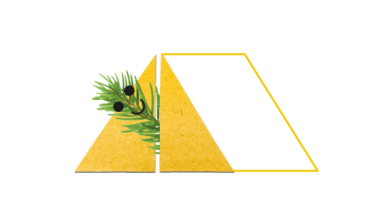
The first step was creating a new name. Easier said than done – especially in a crowded market of contractors and builders, both in Norway and internationally. The name had to resonate locally, be relevant, stand out, and – of course – be available.
The final choice, Snekra, is derived from the Norwegian verb å snekre (en: “to build”). With its short, sturdy form and unique character, the name feels both modern and reliable – a perfect fit for the new company.


Branding & Visual Identity
From there, we developed the brand’s visual identity. Snekra is highly competent, forward-looking, and environmentally conscious – qualities that needed to shine through the new profile.
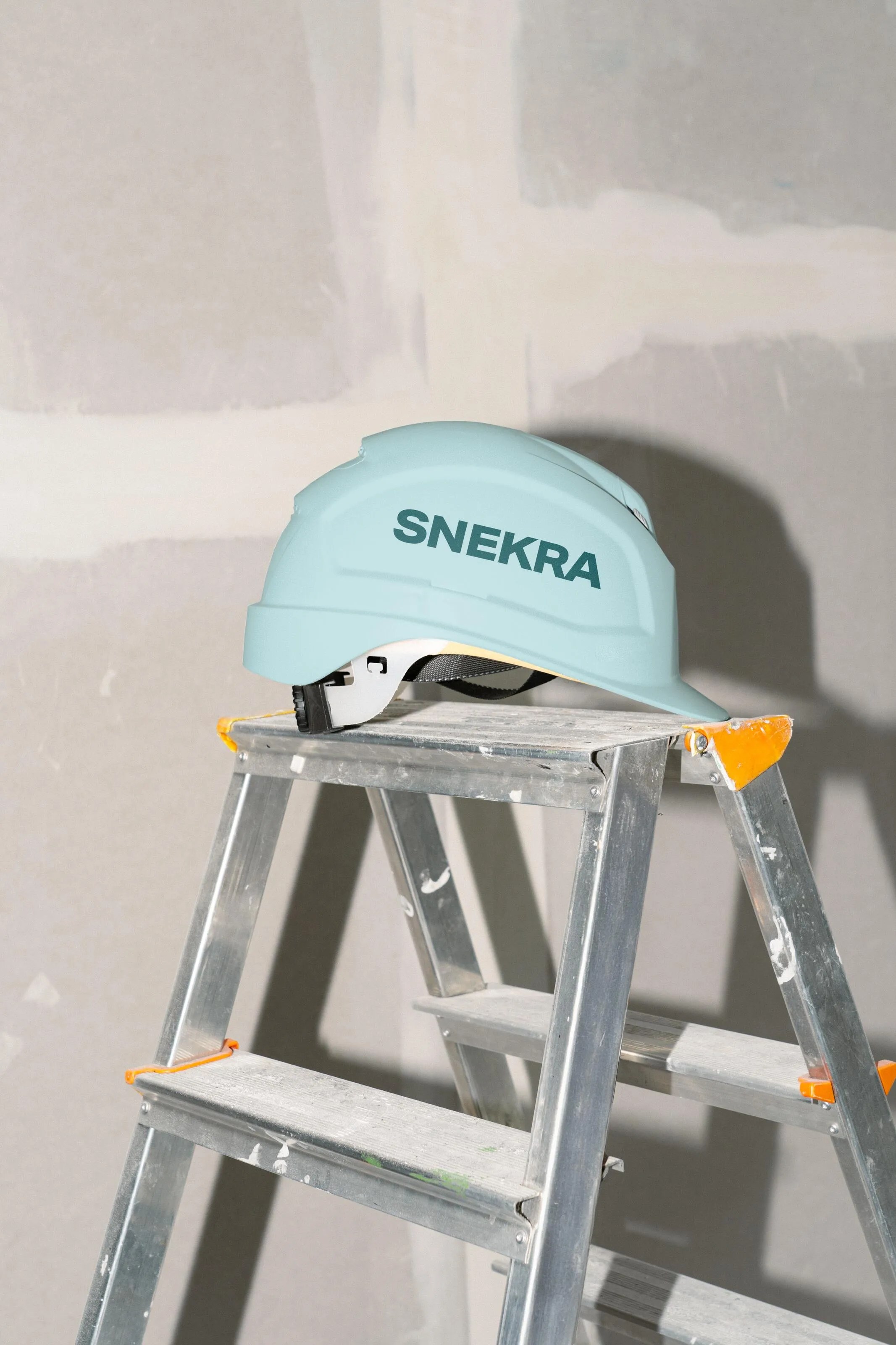
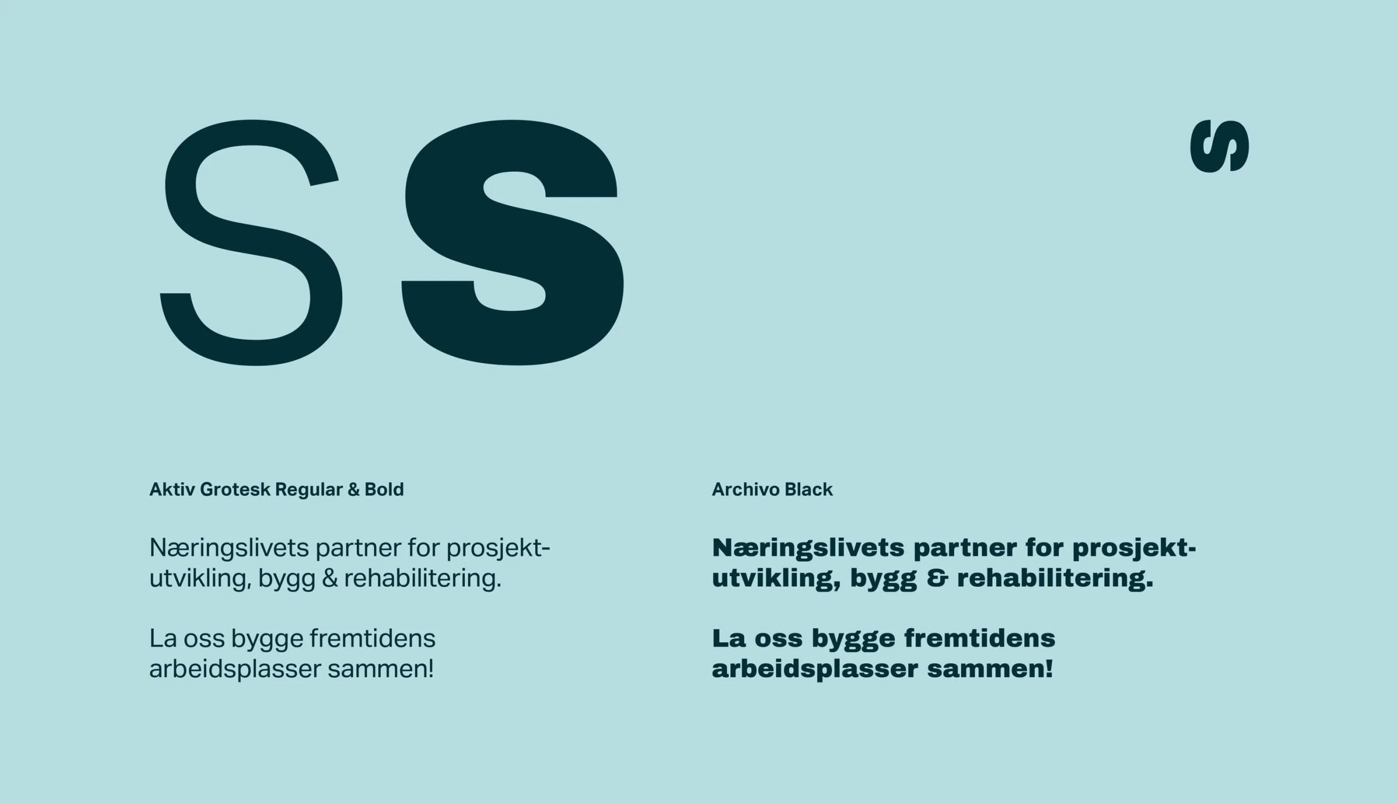
The wordmark was set in uppercase lettering, giving it a confident, solid feel. A blue-green palette was chosen to balance modernity and trustworthiness, while also hinting at sustainability and a grounded, natural approach.
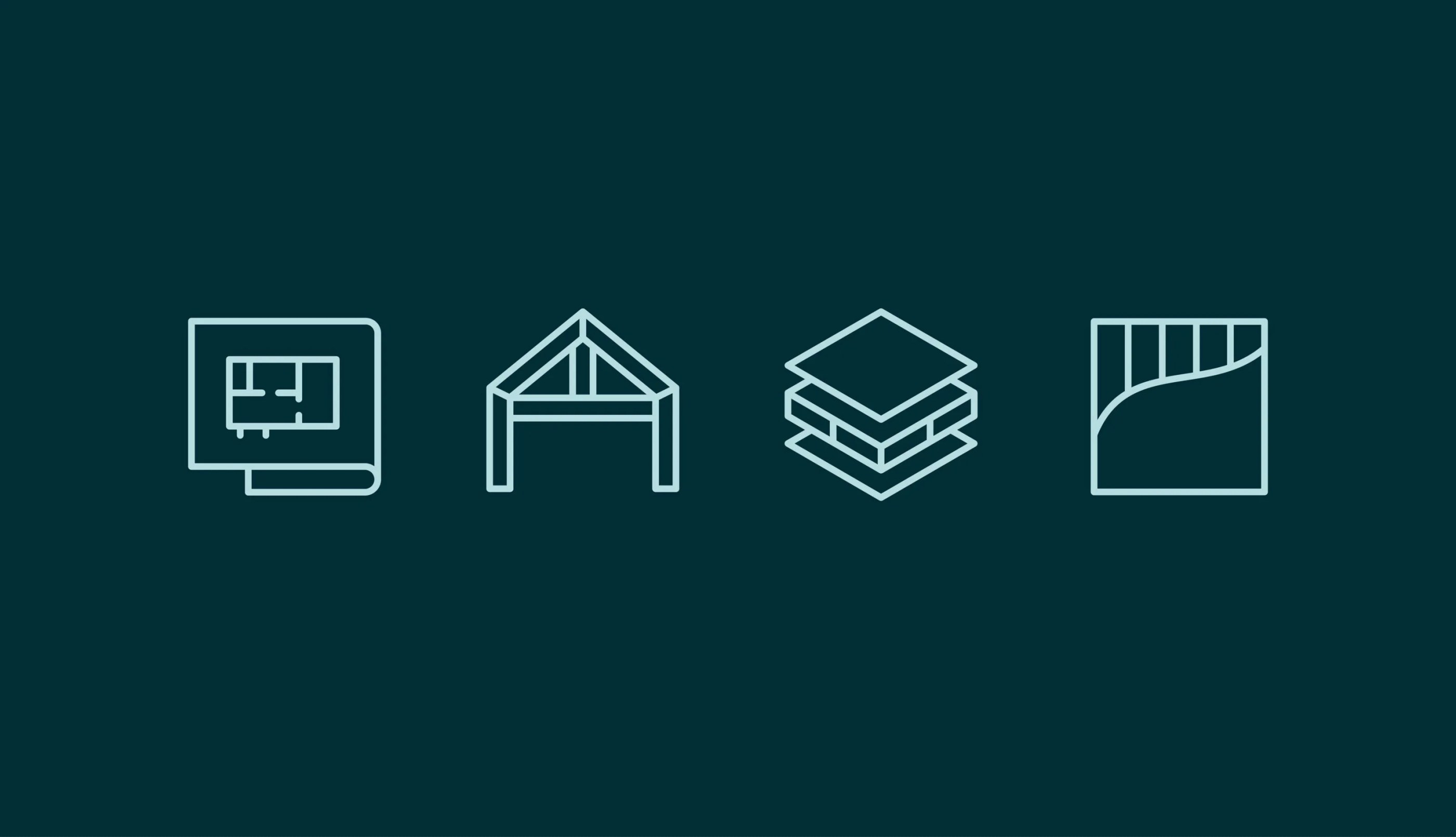
To support clear communication, we also designed icons for their four core services, ensuring an easily navigable and professional expression across all platforms.

Beyond the Logo
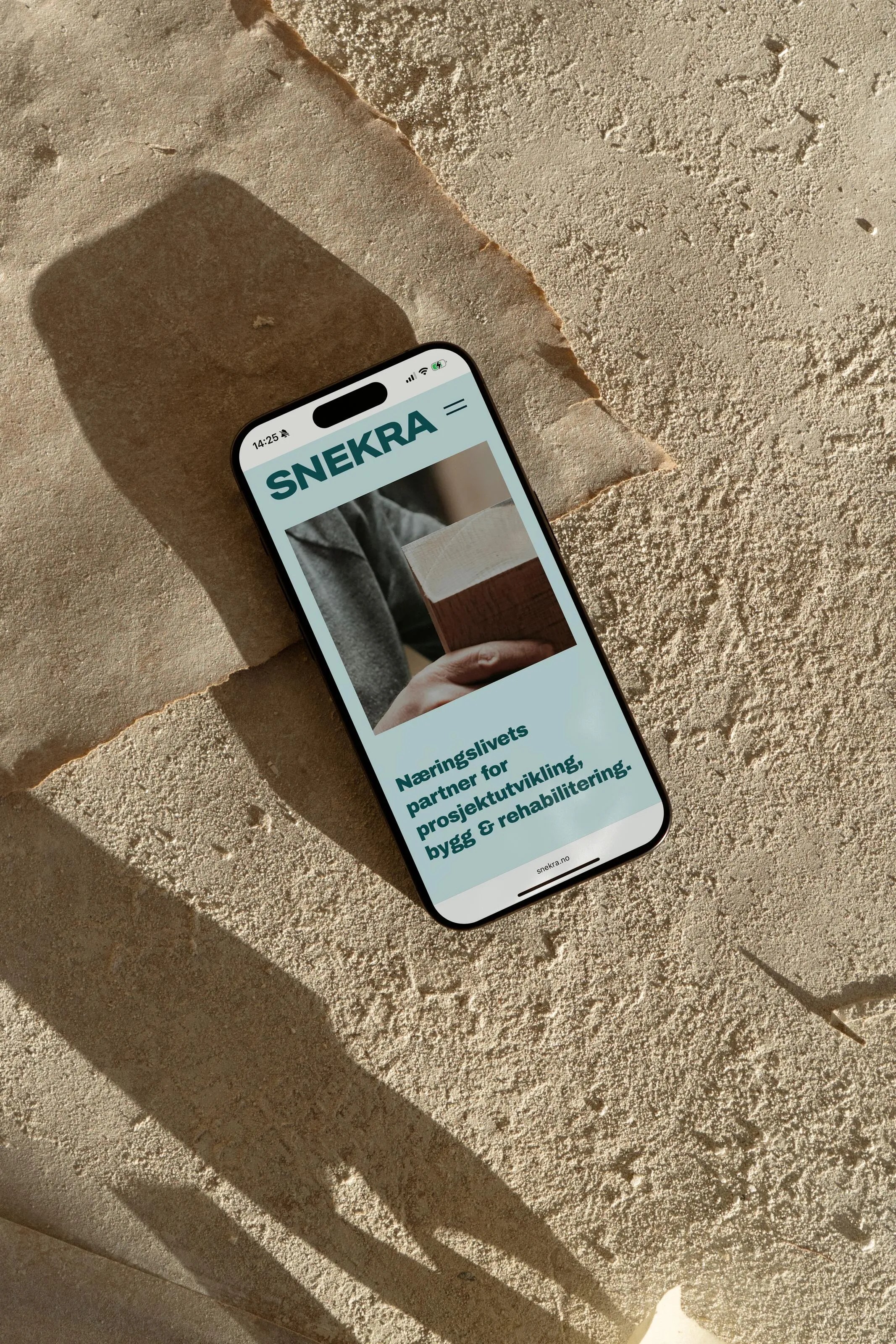
Our collaboration with Snekra extended far beyond just the logo. Together, we worked on copywriting, a new website, as well as visual assets for banners, signage, uniforms, and vehicle graphics.


Brand in Motion
For companies like Snekra, vehicles and uniforms are not just practical necessities – they’re valuable marketing tools. With branded vehicles, the fleet becomes a moving extension of the brand, increasing exposure across the region. By applying the primary brand colours to each vehicle, Snekra builds its recognition while reinforcing its professionalism. Prominent logo placement further underscores the company’s solid character and reputation for reliability.


Result
The result is a comprehensive, modern identity that communicates Snekra’s expertise and ambition – while staying true to their roots in craftsmanship and reliability. With a new name, strong visual identity and consistent presence across digital and physical touchpoints, Snekra is well positioned for growth.


Creating Harmonising Visual Identities for UNOF and NUSO

Launching the Gold Standard of Sample Preparation

The Year of the Orchestras! Celebration, joy, and community combined in one identity

From Alternative Pedagogy to a Science-Based Learning Process

Transforming Norli: Modernising an Identity with Timeless Roots

Clear, Warm, and Professional Healthcare Branding

Website for chef Björn Svensson’s newest and final restaurant, FAN
Creating Håvard the Mascot to Improve User Experience in Oslo City Forests
