Bringing Clarity and Warmth through Design
We were approached to further develop two existing initiatives – Good Patient Pathways (Norwegian: "Gode pasientforløp") and What Matters to You?-day (Norwegian: "Hva er viktig for deg?-dagen") – with the goal of creating cohesive visual alignment between them. The aim was to enhance clarity, cohesion, and professionalism, ensuring both initiatives shared a unified and distinctive visual identity. This alignment was intended to unify communication, increase visibility, and differentiate these initiatives within the broader healthcare landscape.
Client
KS (The Norwegian Association of Local and Regional Authorities) is the interest organisation, development partner, and the largest public employer organisation for the municipal sector in Norway. All municipalities and county councils are members. KS works towards an independent and innovative municipal sector, acting as both a representative organisation and a partner in development. It is also the largest public employer organisation in the country and a key negotiator in wage settlements.
Target Audience
Employees working in municipal healthcare services.
Patients receiving long-term municipal health and care services.

Two Human-Centred Initiatives
Initiated in 2014, Good Patient Pathways (Norwegian: "Gode pasientforløp") is a project led by KS and the Norwegian Institute of Public Health on behalf of the Ministry of Health and Care Services. It builds upon the Holistic Patient Pathway at Home (HPH), a framework applicable to all patients regardless of diagnosis. The goal is to ensure patients are equal partners in designing their care pathways, while helping create coordinated, holistic, and safe healthcare services.
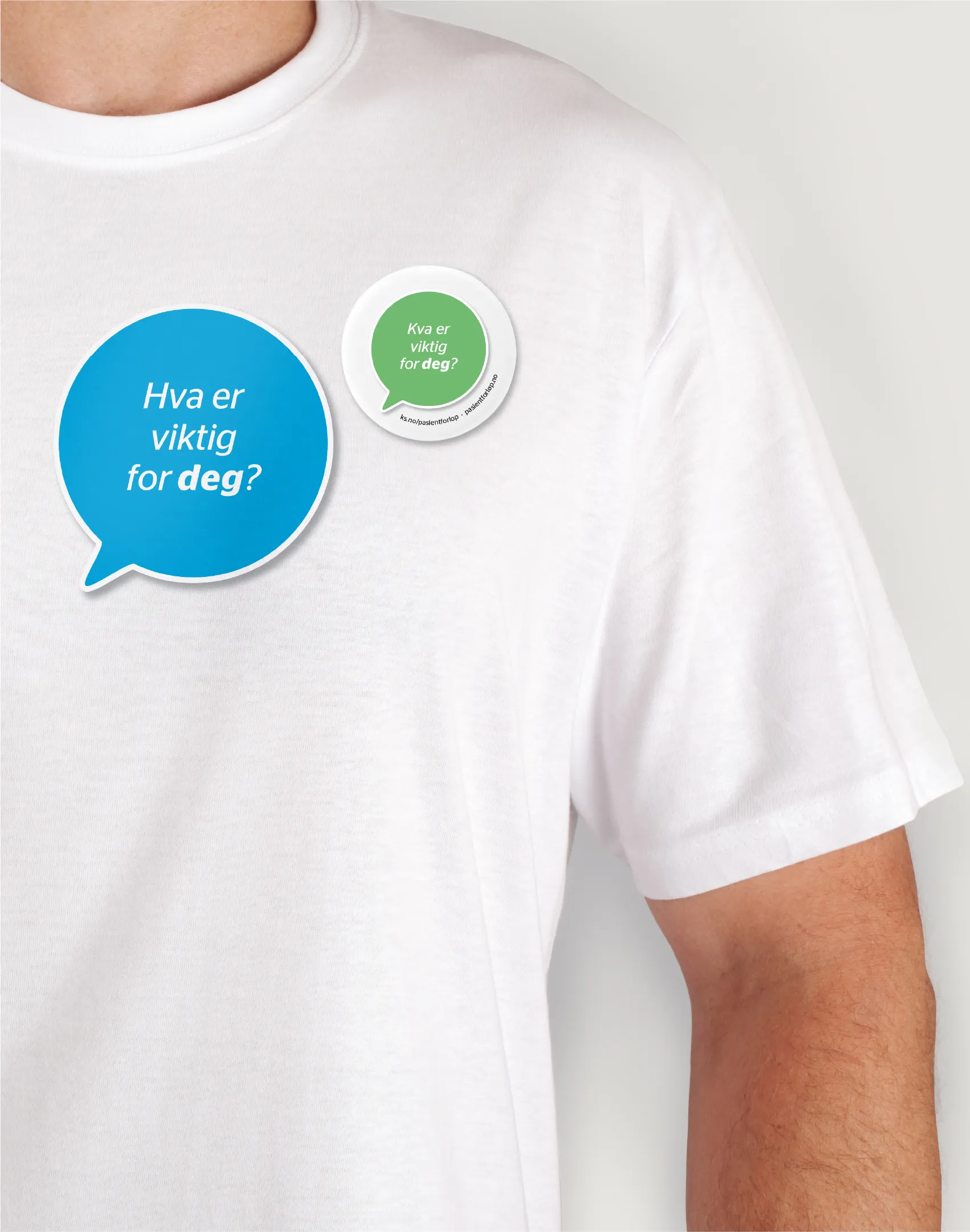
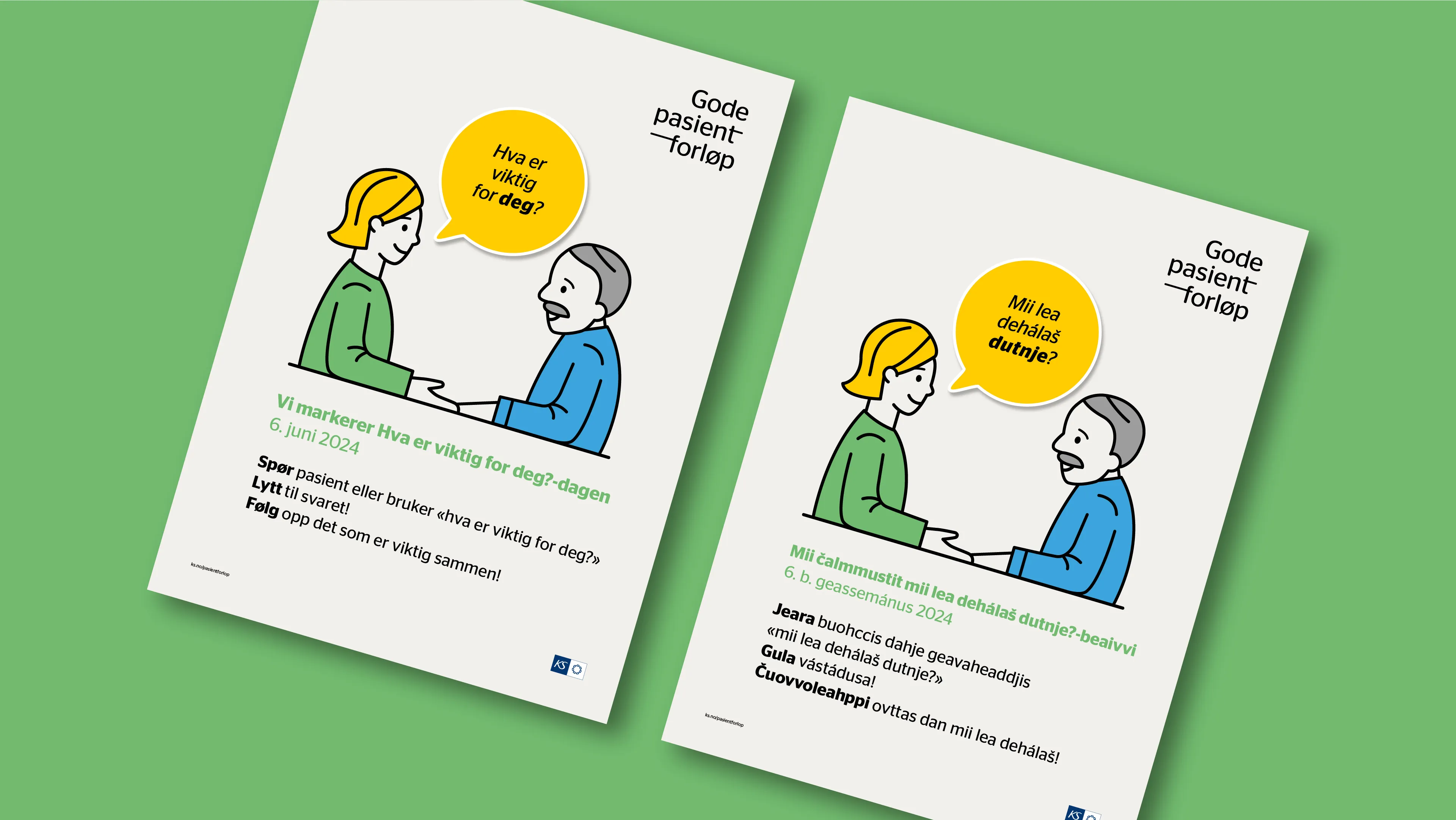
KS is also the creator behind What Matters to You?-day (Norwegian: "Hva er viktig for deg?-dagen"), which is aimed at fostering meaningful conversations between healthcare providers and recipients, ultimately to improve healthcare outcomes.

Warm and Approachable
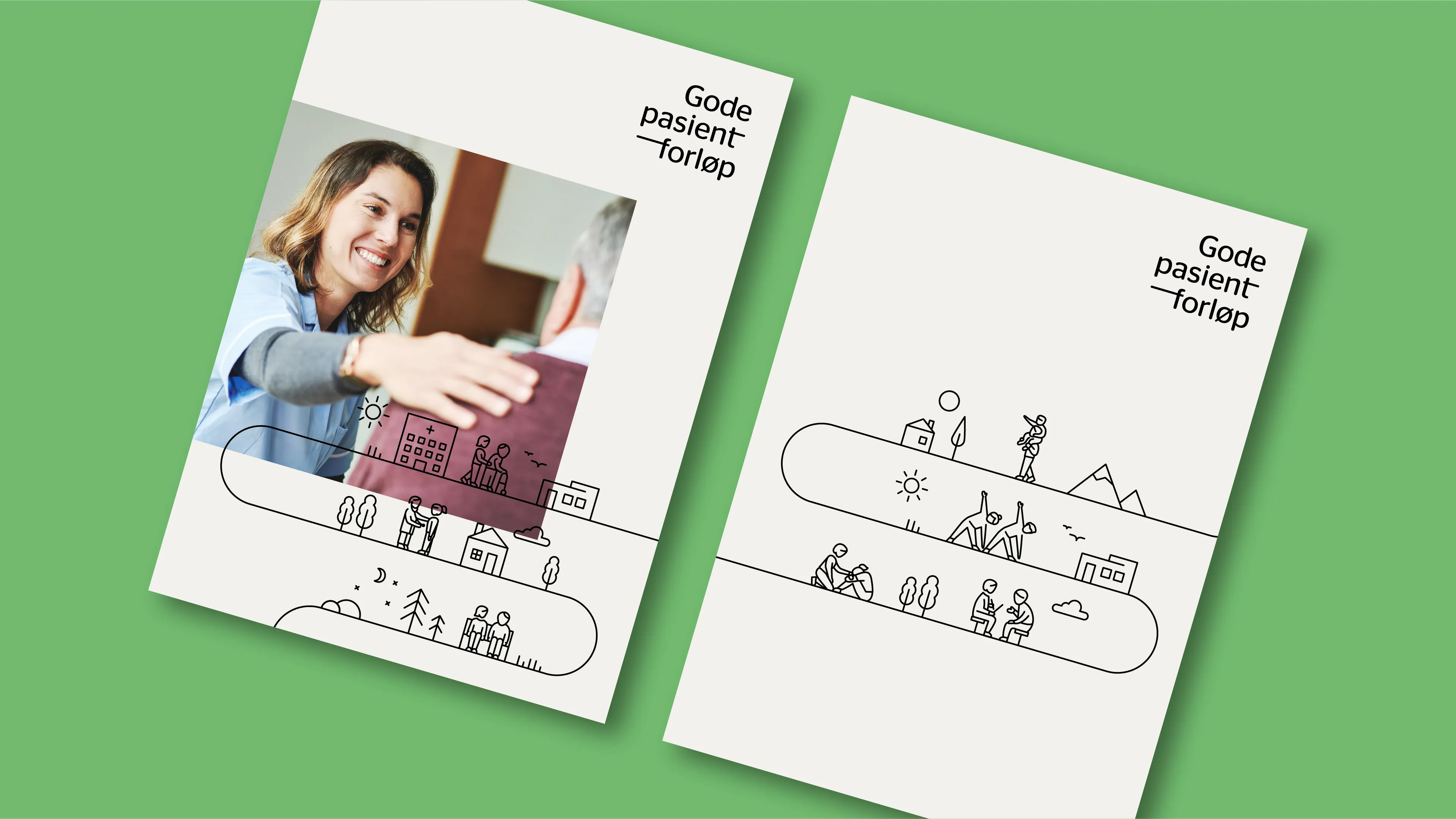
To develop a warm and approachable identity, we chose a typeface with soft, rounded, and humanistic qualities. The wordmark was segmented into three parts to reinforce this welcoming feel. A key focus of Good Patient Pathways is smooth transitions and secure processes, symbolised by an integrated, elongated hyphen in the wordmark – representing the "patient journey." This line evolves throughout the visual identity, transforming into an "action line" paired with illustrations that emphasise the caregiver-patient relationship.


Evolving to New Patient Groups
Initially, Good Patient Pathways focused on elderly and chronically ill patients. To reflect this demographic, we used photography that highlighted themes of care and joy. These images, combined with a fresh colour palette of beige, green, and black, give the identity a modern and inspiring appearance. As the initiative expanded to include mental health and substance abuse services, additional illustrations were developed to better represent and connect with these broader audiences.


Making Complex Healthcare Simple through Animation
As the initiatives continued to grow, KS and Good Patient Pathways wanted to communicate the importance of Norway's Health Partnerships ("Helsefellesskap") – collaborative arenas where municipalities and hospitals work together as equal partners to create a more coordinated and holistic healthcare service. Today, 19 such partnerships have been established across the country, strengthening the connection between local and specialist care.
Building on the established visual identity, we adapted the design language for motion. The central concept – "the line, representing the good patient journey" – became the narrative thread throughout the film. A blend of subtle 3D environments and hand-drawn, outlined characters was used to bring warmth and human presence to the story, whilst maintaining a clear link to the established illustration style.

We provided art direction and project management for the production, whilst the talented animator Jakob Eiring brought the film to life with a thoughtful and elegant execution.
Finished animation
Result
Since its inception in Norway in 2014, What Matters to You?-day has grown into an international movement, with over 30 countries participating last year. The new, comprehensive and professional visual identity has effectively helped showcase the initiatives' purpose and made them stand out clearly within the healthcare sector.
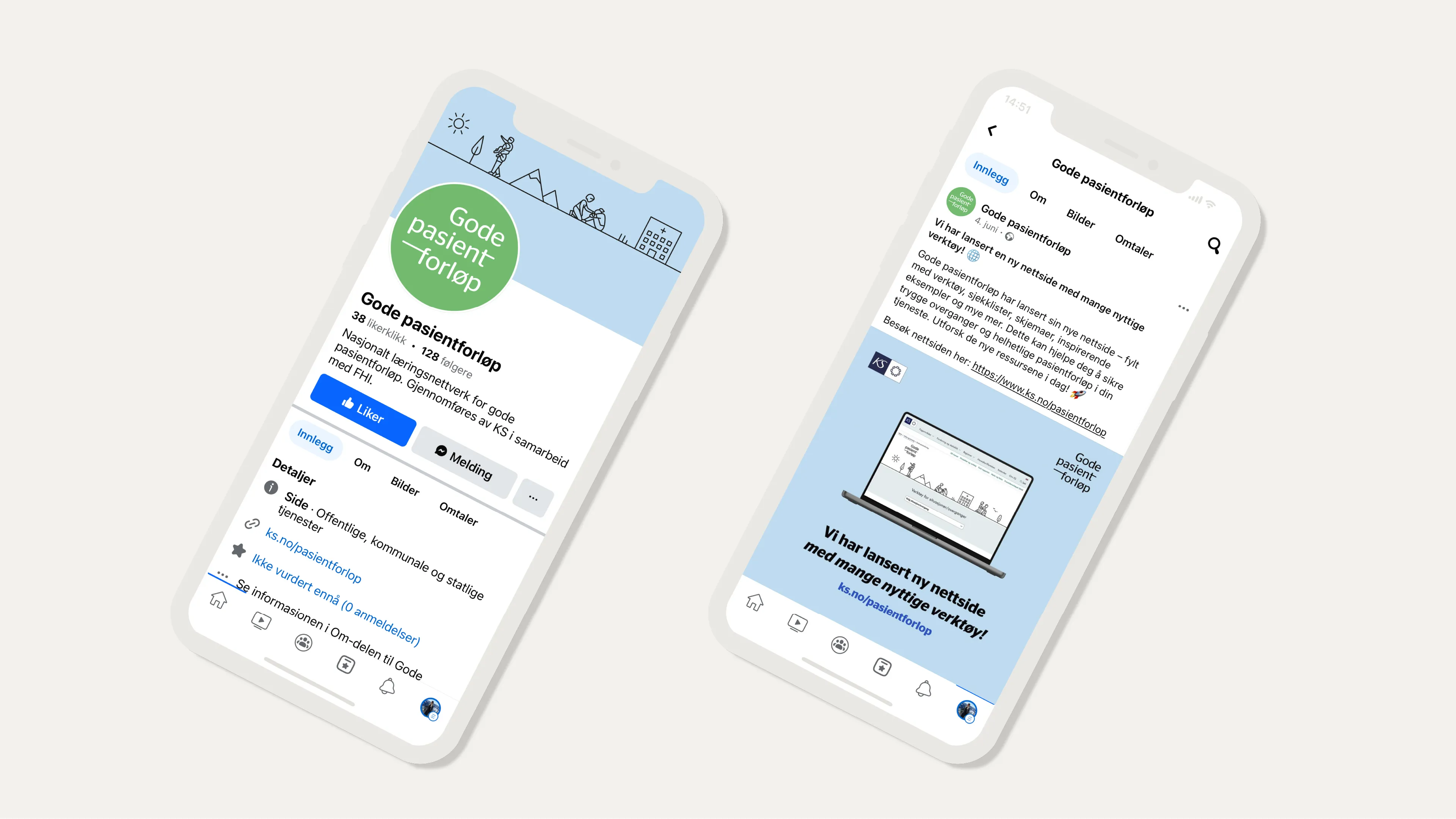
The visual identity have been applied across a range of marketing materials, spanning both print and digital platforms. At every networking gathering where municipalities and hospitals meet, the materials have enabled a consistent and recognisable presence. The elements are actively being utilised, allowing for clearer ownership of the initiatives and a cohesive presentation of both Good Patient Pathways and What Matters to You?-day.
We now have a much more comprehensive and professional profile that effectively showcases who we are and what we do. Amidst numerous projects and initiatives in the municipal sector, our identity has become much clearer and more distinctive.

Want a brand that’s clearer, not louder? We’ll help you simplify, sharpen, and create a better customer experience.