

Norges Orkesterforbund
Reframing a Norwegian Musical Institution
Keeping a strong heritage relevant, recognisable and contemporary
Norske Symfoni-Orkestres Landsforbund (en: Norwegian Association of Symphony Orchestras) saw that their needs had grown beyond what their existing identity could support. It offered few of the building blocks needed for clear, consistent communication.
They asked us to help clarify who they are and how they communicate. How could we make the organisation more relevant and recognisable without losing the credibility and traditions built over more than 75 years?

From NASOL to Norges Orkesterforbund
Naming was not part of the initial brief. Our discovery work revealed that their formal name and the NASOL acronym no longer reflected who they are and often required explanation.
So we raised a simple question: was the name still doing its job?
The organisation was founded in 1948 as Norske Amatørsymfoniorkestres Landsforbund (en: Norwegian Association of Amateur Symphony Orchestras). In 1978, it changed its formal name to Norske Symfoni-Orkestres Landsforbund, but retained the NASOL acronym. Over time, the full name became cumbersome and the acronym gave little meaning to anyone outside the organisation.
We proposed Orkesterforbundet as a clearer and more accessible name. The organisation chose to retain Norges to make its national role explicit. The result was Norges Orkesterforbund (en: Norwegian Association of Orchestras), with Orkesterforbundet used in everyday communication.
The new name removes the need for explanation. It says what the organisation is, who it represents, and gives it room to speak more clearly to the wider orchestral community.

More than administration
Norges Orkesterforbund is more than an administrative body. It brings orchestras together and supports them with knowledge, artistic development, and practical guidance.
The new identity needed to carry the authority of a national federation while feeling relevant to the musicians, conductors, volunteers, and leaders who make local orchestral life possible.
The goal was to capture the ambition and diversity already present in the organisation, rather than just making classical music look younger for its own sake.
Classical with Pulse
To achieve this, the visual direction is built around the idea of Classical with Pulse: tradition with energy, history with movement, and artistic quality with a contemporary perspective.
The design system is composed and credible for formal contexts, yet flexible enough for dynamic event communication and social media.
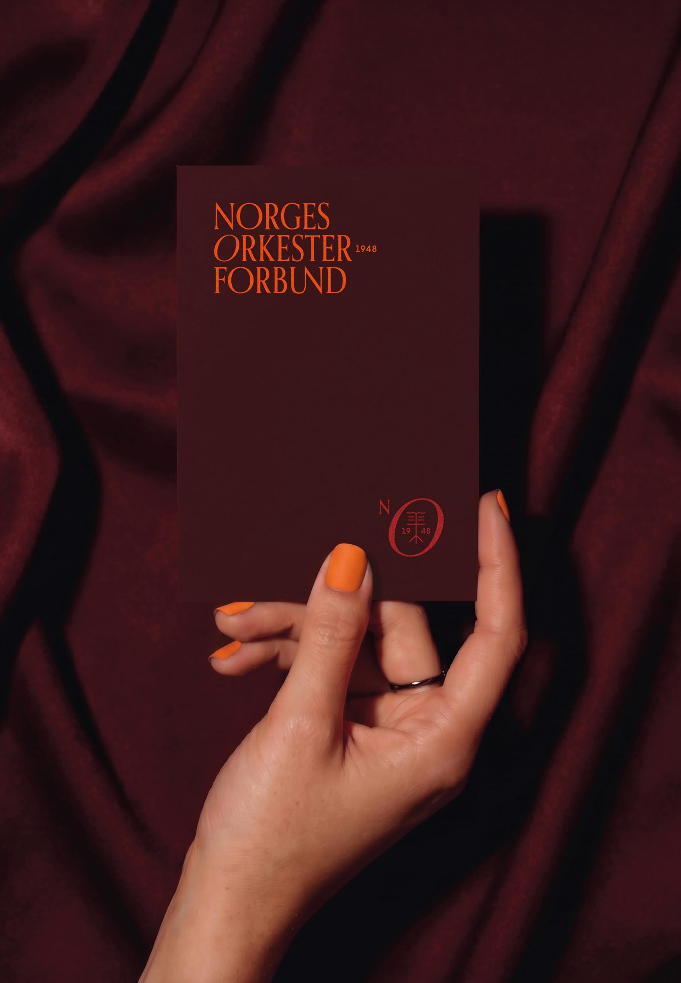
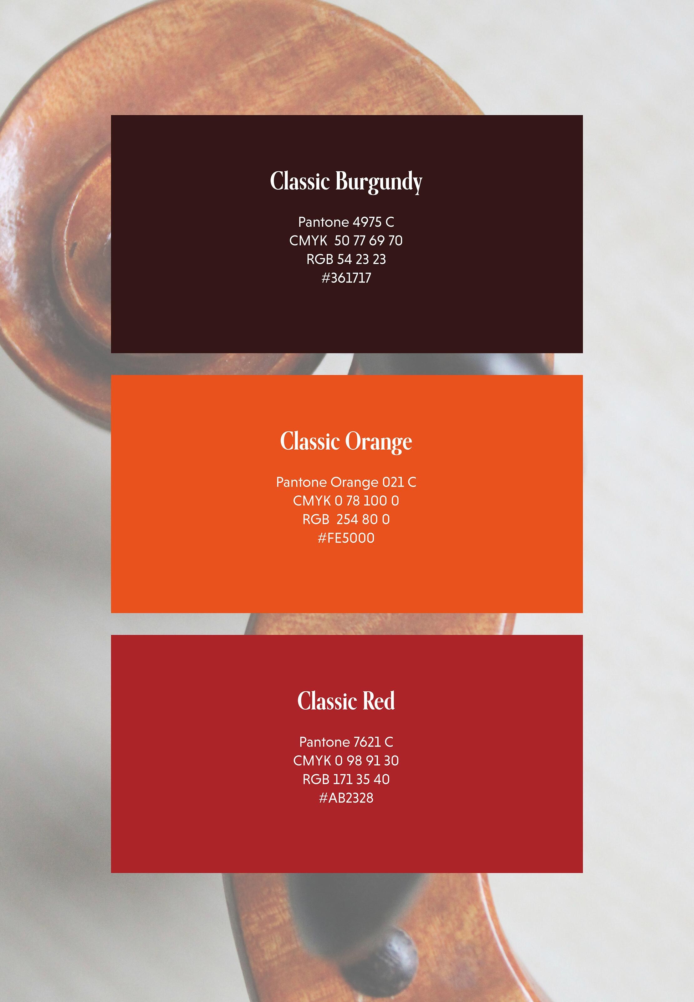
This balance is reflected in the colour palette, which combines deep burgundy and red with a vibrant orange. Together, the colours create a visual language that feels classical without becoming traditional – and energetic without losing its sense of refinement.

A wordmark with movement
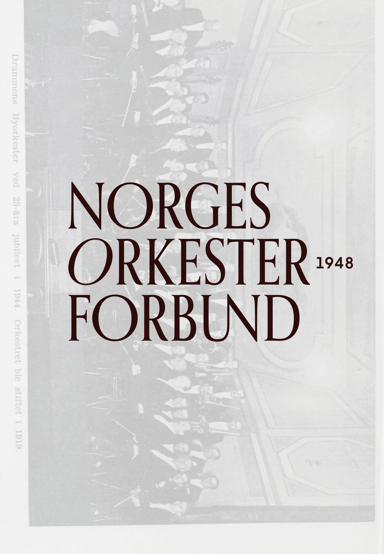
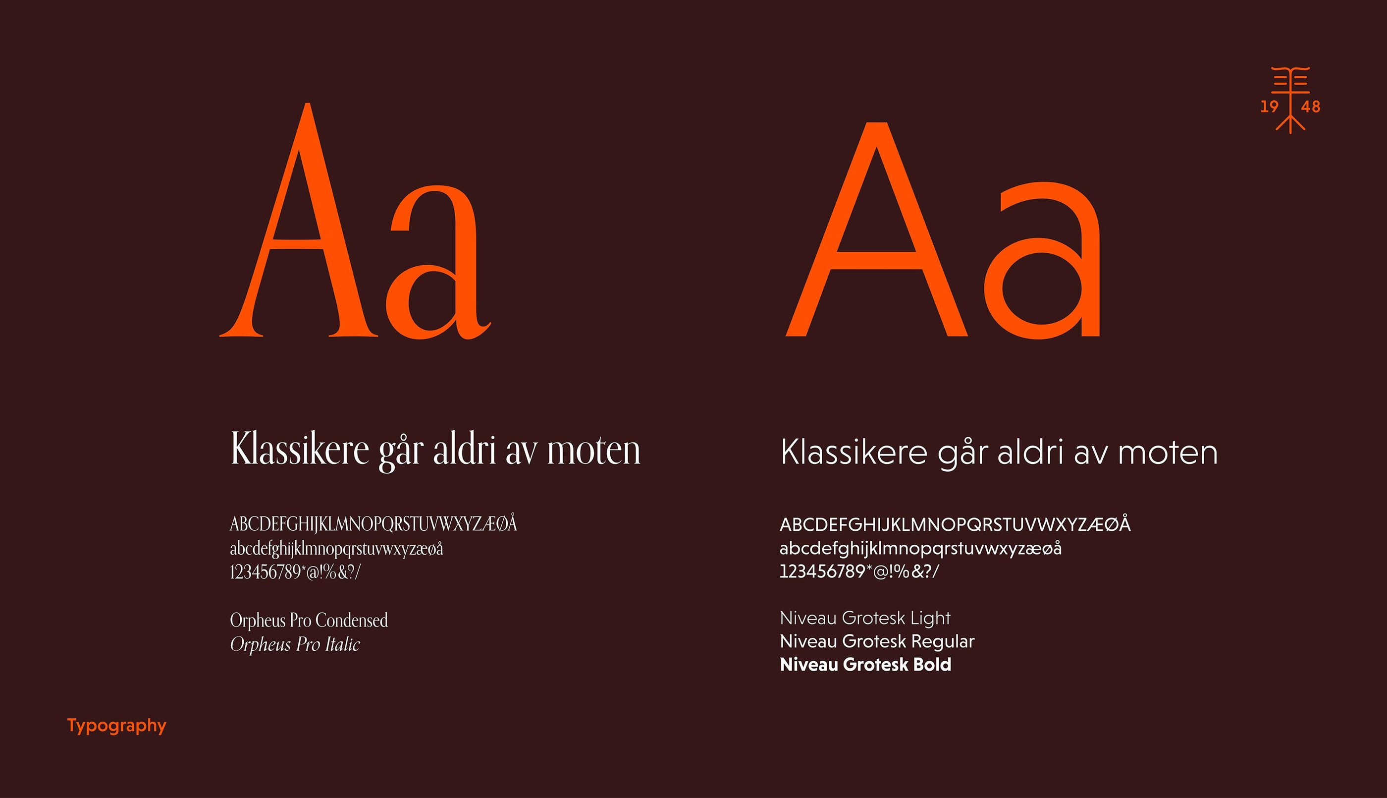
The wordmark is a clean, three-part typographic construction based on Orpheus Pro, a classic, elegant typeface with a subtle connection to the organisation’s heritage. Its condensed treatment gives the identity a more distinctive character, while alternating upright and italic Os create movement within the wordmark, with a subtle reference to musical notation.
The founding year, 1948, is integrated into the wordmark as a small dividing element. On interactive digital surfaces, this element can be replaced by different musical symbols and notation-inspired forms, introducing a playful and dynamic layer to the identity.
The result is an identity that combines sophistication and authority with movement and personality.
A symbol of quality and community
Alongside the wordmark, we developed a distinctive secondary symbol to act as a visual quality mark and supporting identity element.
The symbol draws elements from the wordmark and combines the letterforms with a music stand motif. It represents Orkesterforbundet’s role in bringing orchestras together across Norway, while providing a flexible graphic element that can stand independently from the full logo.
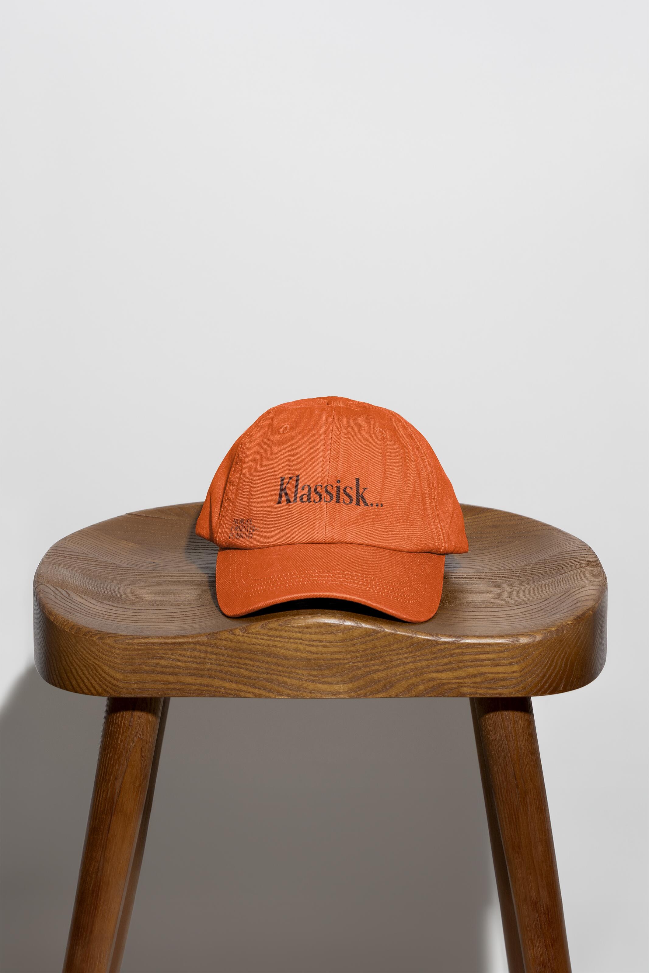
Together, the wordmark and symbol create an identity system that can adapt across digital platforms, printed materials, events and merchandise.

Past and present in one system
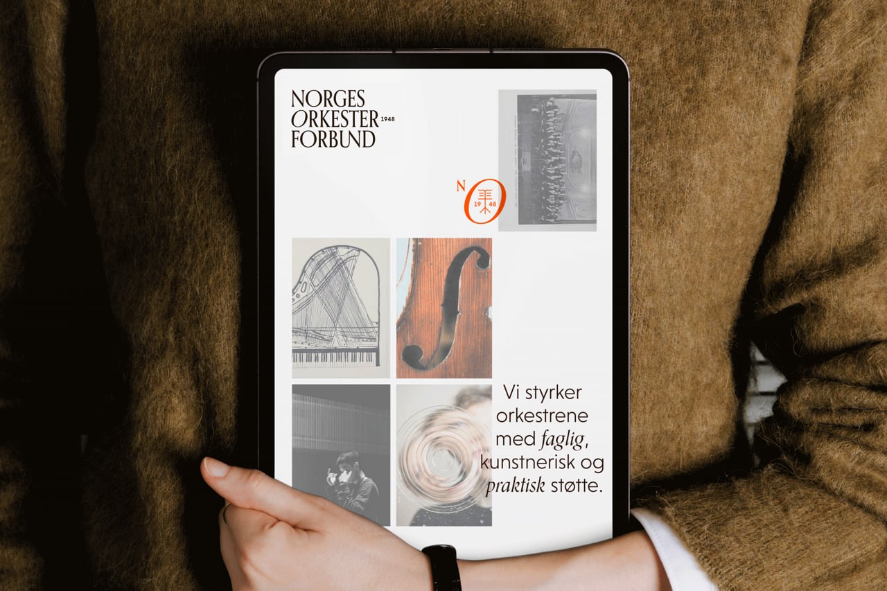
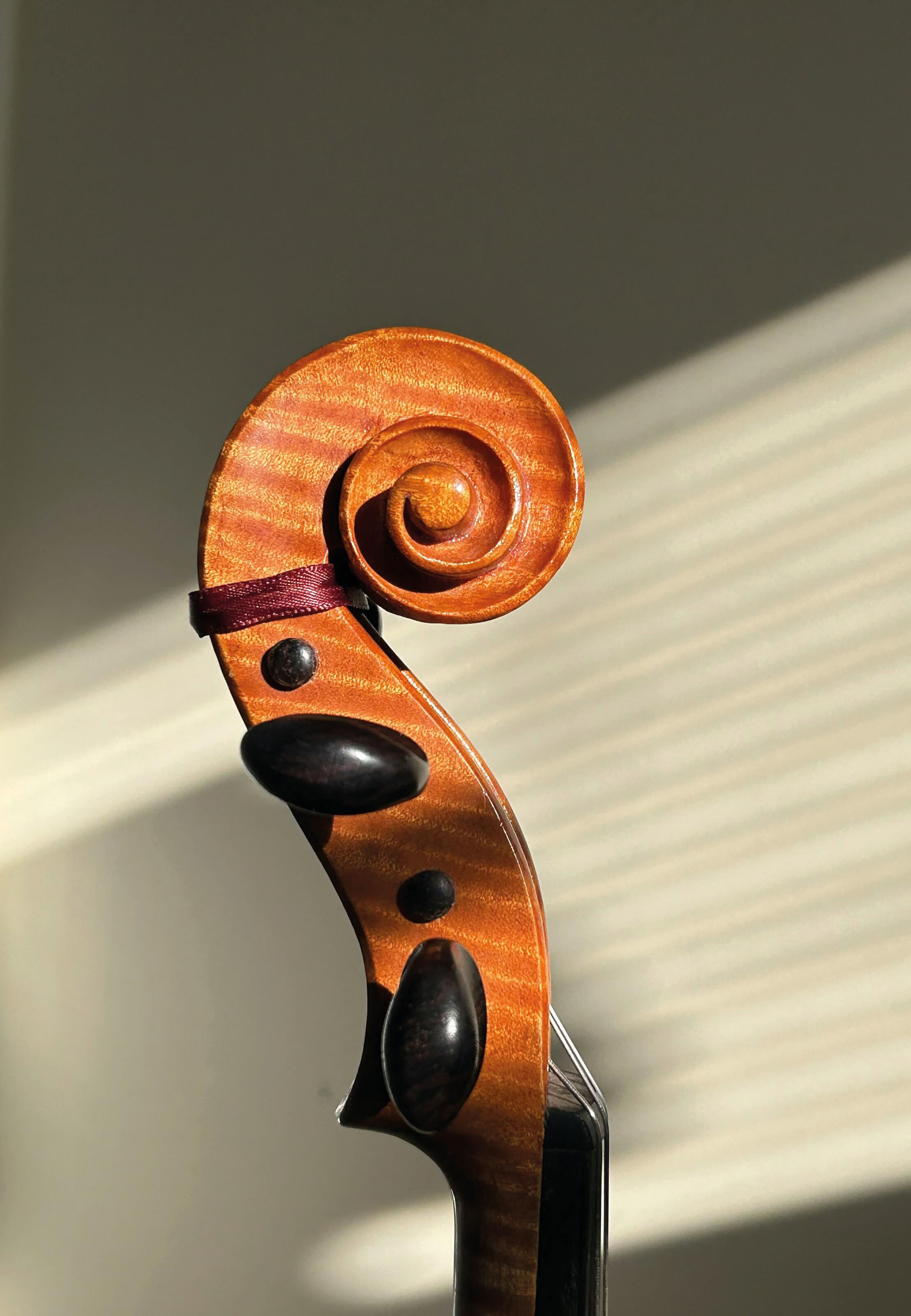
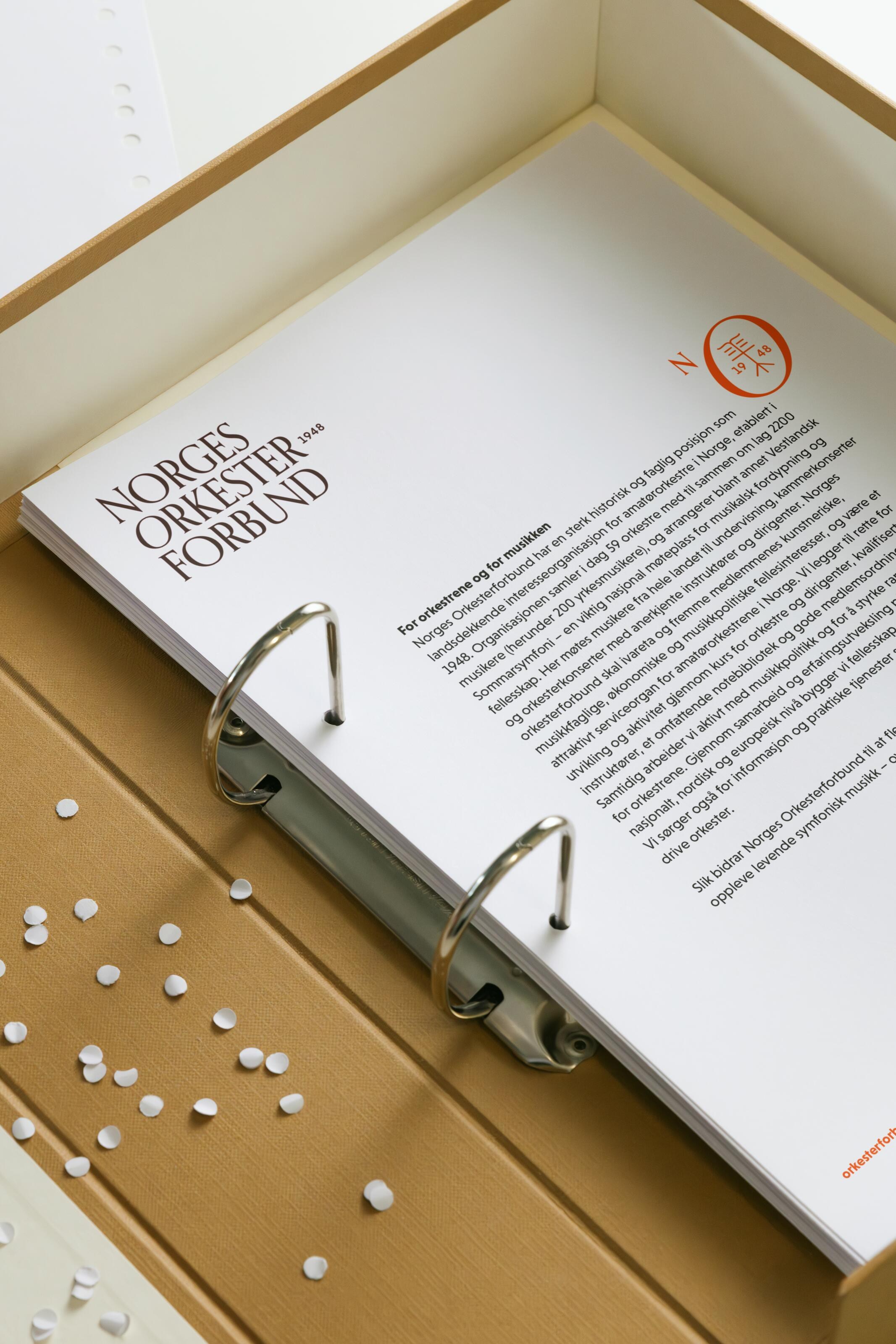
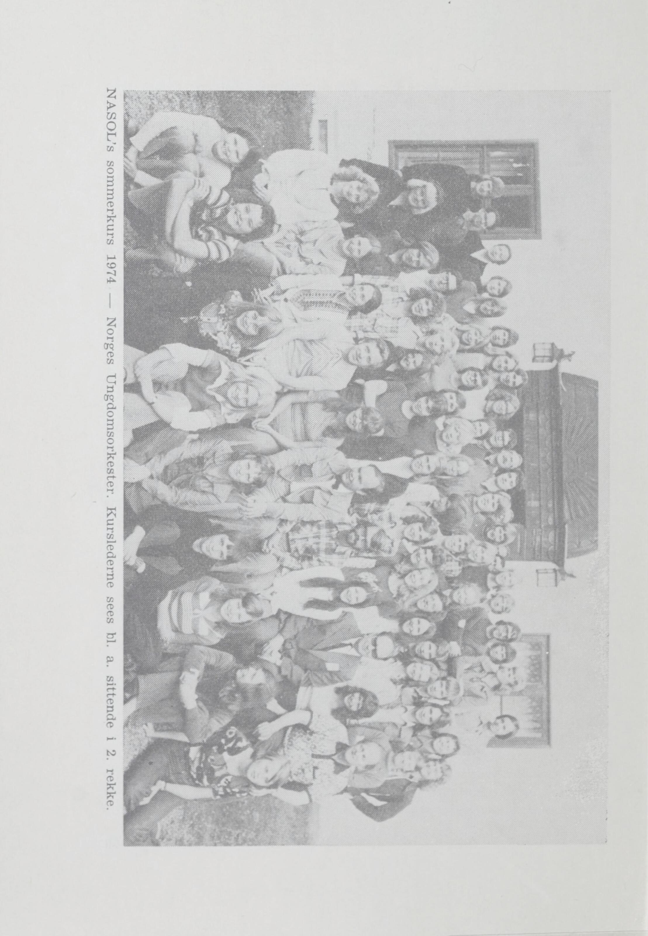
Photography became an important part of expressing the organisation’s heritage and its future. Norges Orkesterforbund has more than 75 years of photographs, documents and musical history.
Rather than separating past and present, we created a direction that combines historical archive photography with contemporary images of conductors, musicians and musical movement, allowing them to exist together as part of the same story.
A modular grid gives images from different periods and formats a shared structure. A consistent treatment using transparency and tonal adjustments creates a more cohesive visual character across images of varying age and quality, while adding a subtle archival feel to the overall expression.


A flexible identity
The new identity was developed as a flexible system rather than simply a new logo.
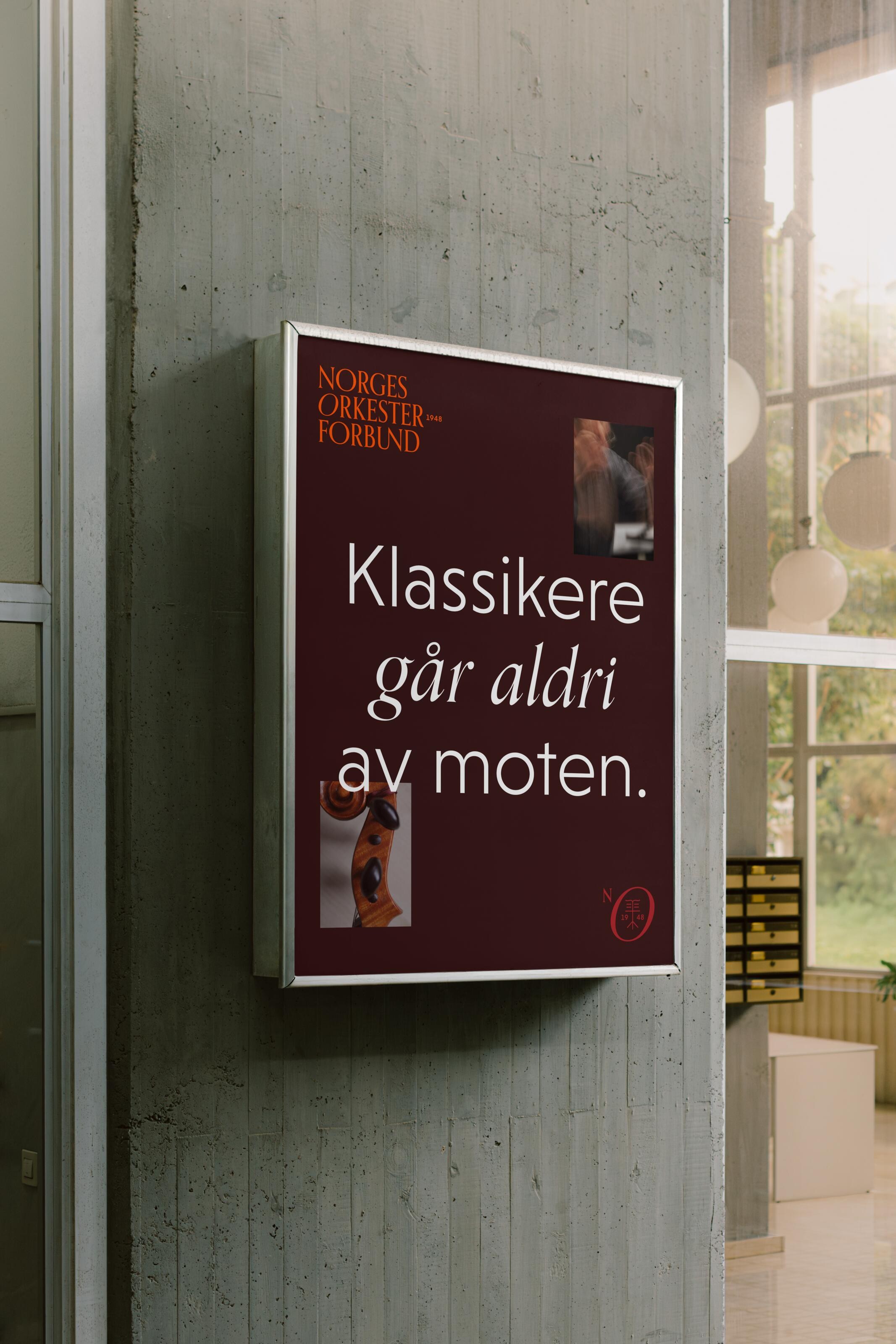
A comprehensive brand guide defines the use of colours, typography, imagery, graphic elements, logo variations, poster templates and merchandise. This gives Orkesterforbundet a consistent visual foundation across its communication and makes it easier for the organisation to manage and develop the brand over time.
The identity works across both traditional and digital formats, from large-format communications and event materials to social media and small-scale interfaces.


Result
Norges Orkesterforbund now has a name that clearly communicates its national role without relying on an acronym that requires explanation. The new identity gives the organisation a stronger and more contemporary platform for the future – one that respects its history while reflecting the energy, ambition and diversity of today’s orchestral community.
By combining a clearer name, strategic positioning and a practical visual system, the project helps position Orkesterforbundet as an inspiring and professional resource for orchestras across Norway.
A brand with history, but also with movement.


Creating Harmonising Visual Identities for UNOF and NUSO

The Year of the Orchestras! Celebration, joy, and community combined in one identity

Transforming Norli: Modernising an Identity with Timeless Roots

Perception vs. Reality: Making the Brand Match the Product

Where tradition meets modernity in construction branding

Transforming the Alterna Interior Brand to the Nordic market

From Alternative Pedagogy to a Science-Based Learning Process

Clear, Warm, and Professional Healthcare Branding
Creating Håvard the Mascot to Improve User Experience in Oslo City Forests
